The Scariest Library
I am going to spend the next 5,000 words complaining about library architecture. Let’s see if I can keep you excited.
(NOTE: This post contains many images, so you may want to read it on a large screen. It also includes Renaissance paintings with nudity, so be prepared. Also, I am happy to report that my Kickstarter was a great success and raised a over 200% of its goal. This will let me organize more performances and other expansions of the project. Many thanks to the readers who chipped in.)
Michelangelo was a profoundly angry person. Manifold grievances accumulated over his unreasonably long life: against picky, stingy, and fickle patrons, against incompetent suppliers and cracked marble, against rival artists and their partisans, against ungrateful and ambitious students, against frustrated love and the Renaissance criminalization of homosexuality, against manipulative popes and his Florentine homeland which never did enough to protect him from them, against lawsuits over fees and contracts whose endlessness swallowed years of productivity, against painting, which he kept getting sucked into even though he hated it (Michelangelo’s bumper sticker: “I’d Rather Be Sculpting”), not to mention against plague, famine, war, debt, Borgias, Frenchmen, Pisa, and all the usual butts of Renaissance Florentine hatred.
We see Michelangelo’s accumulated wrath in late works, like the Last Judgment in the Sistine Chapel. The much earlier Sistine ceiling (1508-12) is a coherent progression of Old Testament scenes framed by luxurious painted fake architectural elements covered with naked men lounging around in pleasant poses that would be easy to carve out of marble (“See what I’d rather be sculpting!”). It has strange elements, among them the fact that each biblical scene is held up by four naked men (“Look what I could sculpt!”) sitting on pillars painted to look like carved marble held up by two more naked men (“I could use marble!”) flanked by other naked men made to look like gilt bronze (“Bronze is great too!”), for a ratio of sixteen gratuitous naked men to each Bible scene (“Please let me sculpt something!”).
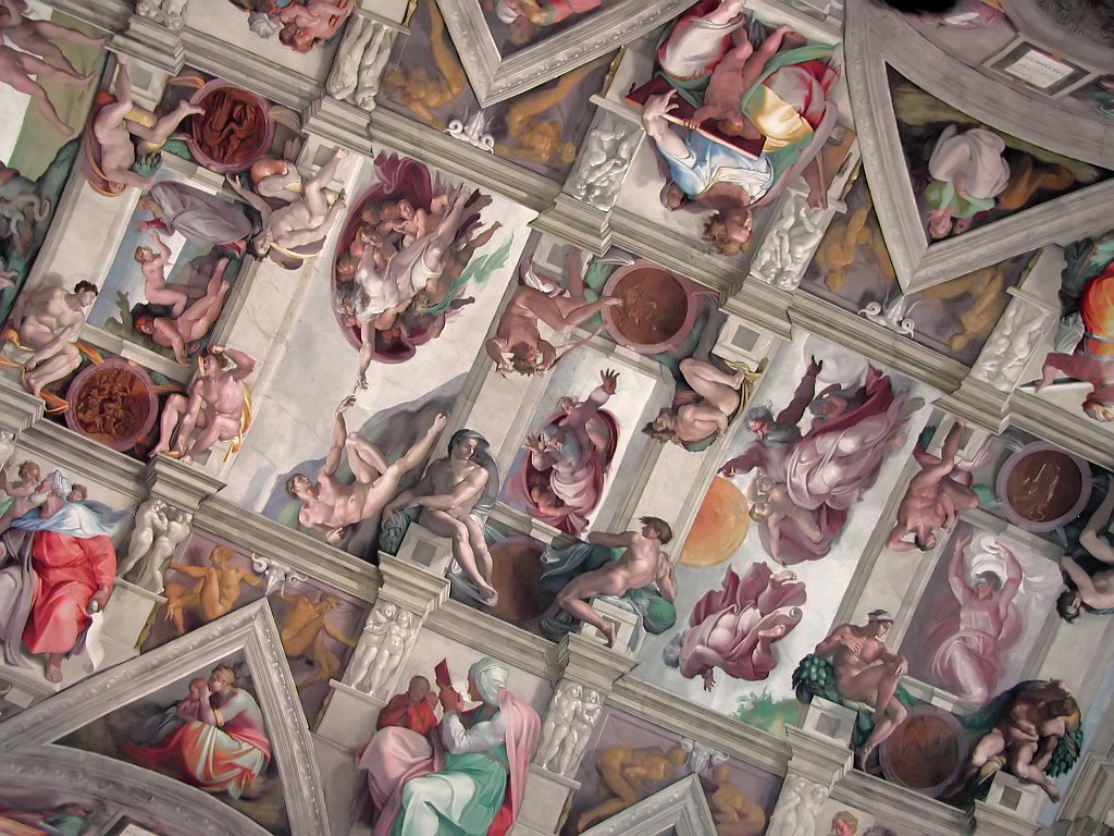
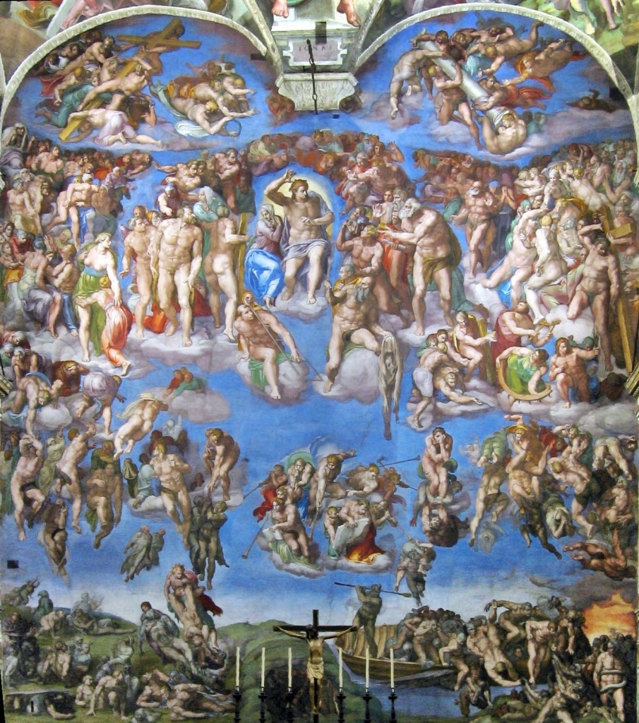
Strange and novel as it was, the Sistine ceiling was a brilliant and comprehensible expansion of the artistic ingredients of its era, one which all comers could understand and enjoy. It was instantly hailed as a masterpiece and much admired and praised, and it instantly made complex painted fake architecture the standard vogue for fresco ceilings, displacing the popularity of the old blue-and-stars. In contrast, Michelangelo’s Last Judgment on the altar-side wall of the chapel, painted more than twenty years later (1536-41), is a chaotic ocean of exaggeratedly muscular bodies massed without order or structure, and even the most beloved Spot the Saint stars are barely identifiable.
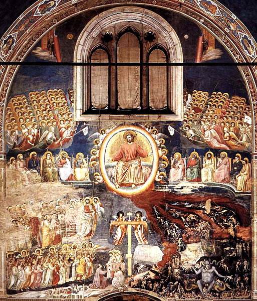
Here, for reference, are a couple examples of more standard Last Judgments. Note the traditional layout: Christ the judge in the center, with Mary at his right and John the Baptist at his left. On either sides, ranks of the blessed watch in prayer and reverence, usually with Peter and Paul prominent among them. Below, tombs are opening and the dead emerging, and on Christ’s right (our left) the blessed are being raised to Heaven, while on the left the damned are led off to Hell.
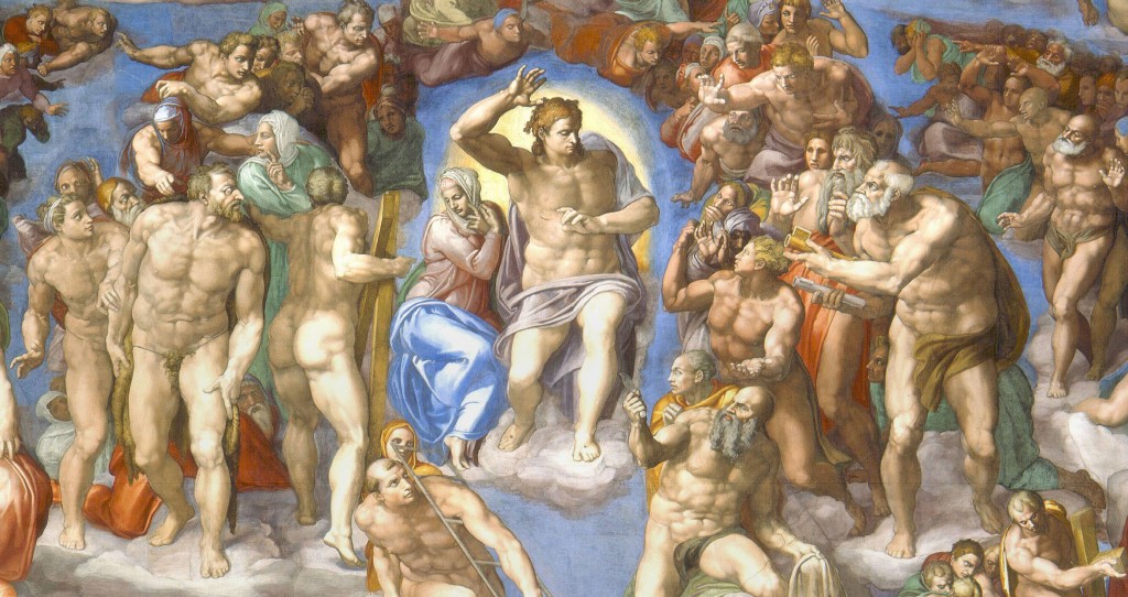
Michelangelo’s is radically different. Calm, ordered structure has been replaced by a sea of chaotic, disorganized clusters of figures, and masses of muscular flesh.
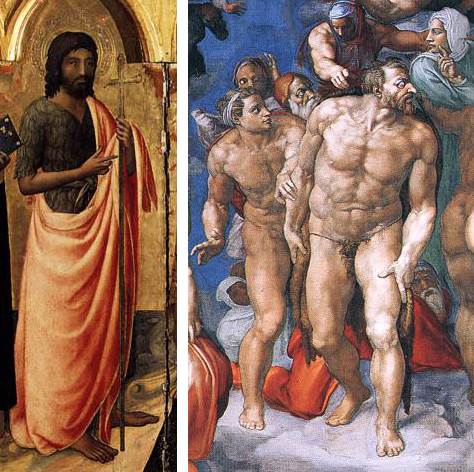
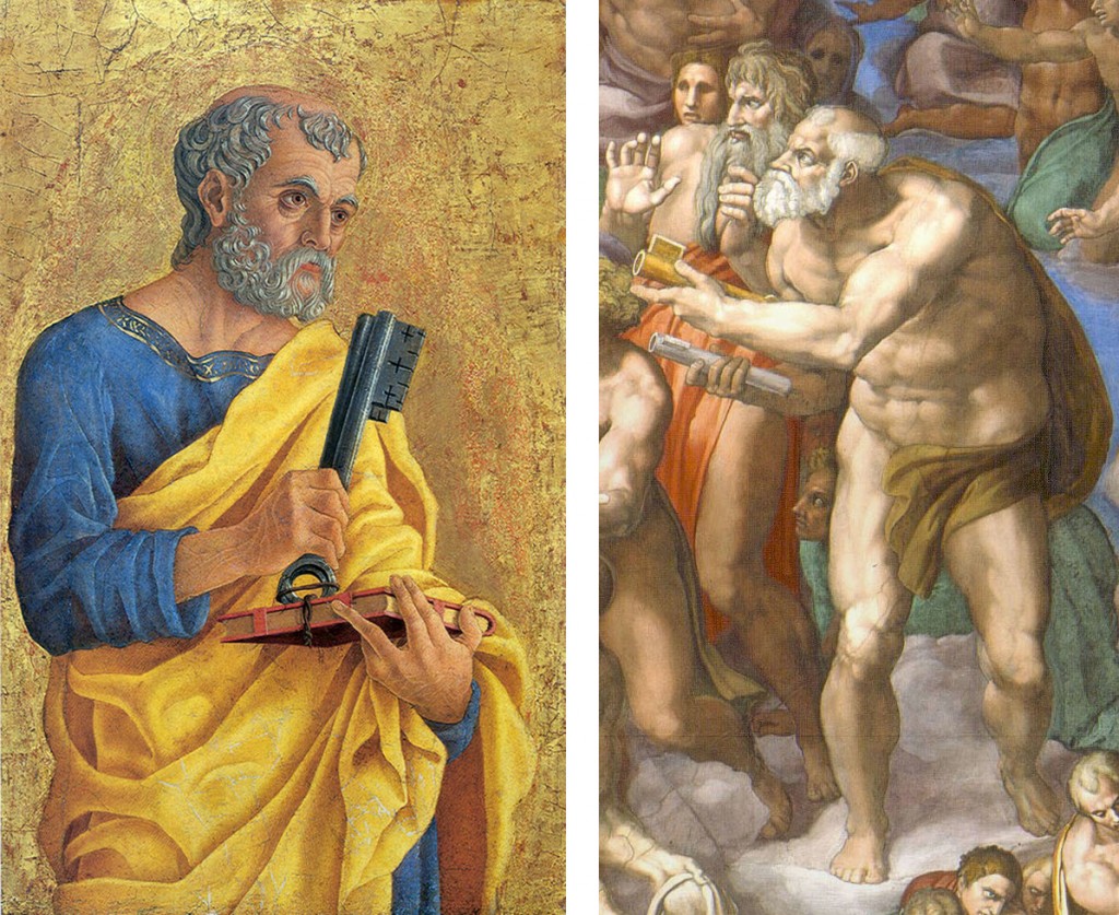
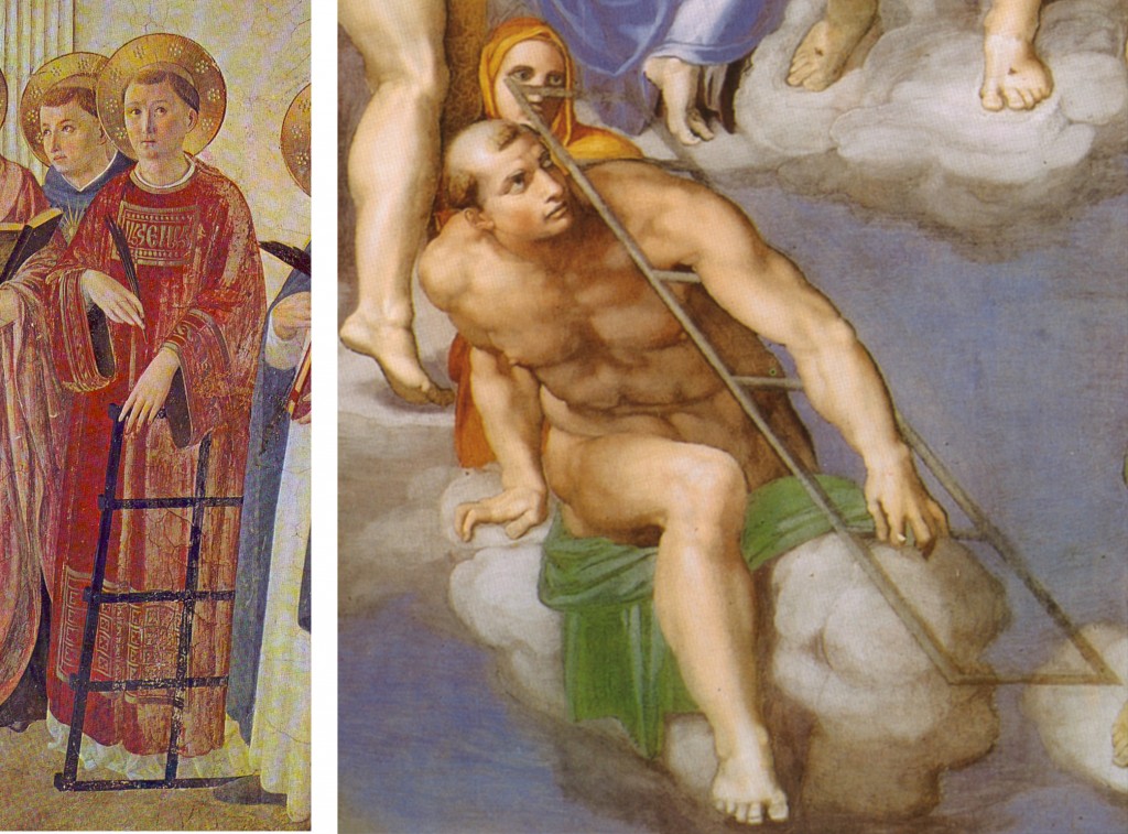
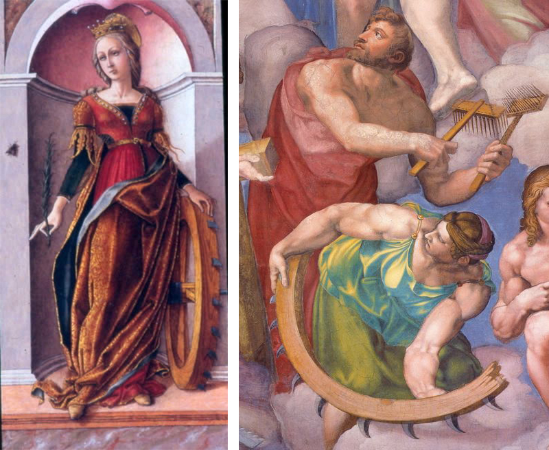
Easy-to-recognize figures fade into the muddle. Here, for example, are some Spot the Saint friends in familiar forms, and in his:
We now recognize that Michelangelo’s Last Judgment is a masterwork, and while individual modern people may like it or not depending on taste, we do not, like its original patron, find it so terrifyingly challenging that we want to paint it over, but we can certainly see why it shocked people as it did, and sometimes still does.
The Sistine Chapel is not a library, but I present this sketch of Michelangelo’s rage to help you understand the vestibule into which we are about to stray.
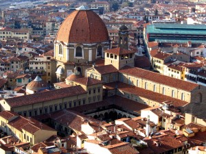
The Laurentian Library (Biblioteca Laurenziana), where I often work, was commissioned by the Medici in 1523. With their second pope (Clement VII) solidly enthroned and Florence subdued, they wanted to add the world’s most sophisticated library to the already stunningly sophisticated architectural masterpiece which was the neoclassical Medici church of San Lorenzo. The library had many goals—to entice scholars, safeguard the collection, glorify the city—but above all the project aimed to ensure that the Medici’s famous collection of rare books and scholars was suitably displayed, an advertisement to all visitors that they were Europe’s most learned noble house (“We’re nobles now! We bribed the right dudes!”). Petrarch’s successors had spent over a century filling Florence with rare classics and commentaries from the far corners of the accessible Earth, and time and wealth funneled these into Medici hands. Thus, the Laurenziana at its birth was staggeringly close to being what humanists had dreamed of: a new Alexandria, collecting ancients and moderns, pagans and Church Fathers, poets and clerics, Greeks and Latins, even Hebrew sources and many translated out of Arabic, assembled and organized for the use of a newly-learned world. Such a gem deserved a worthy jewel box.
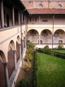 When Michelangelo was commissioned to take on the San Lorenzo library, his patrons wisely instructed that he leave intact the mathematically-perfect neoclassical external structure of the church, and its elegant cloister. All Michelangelo’s additions are internal, the layout of windows and benches, panels and decoration.
Reached by an unassuming door to the left of the church façade, the cloister remains to this day a welcoming and peaceful haven, whose cool, citrus-scented air washes away the city’s outside bustle. This architectural vocabulary was familiar to any Renaissance visitor, with the rows of pillars and the single central tree which formed the heart of any monastery, though with slightly more perfect ratios, giving it a neoclassical edge.
Thus it is with an air of awe, comfort and anticipation that our Renaissance visitor ascends the steps to the upper floor to enter the famous library.
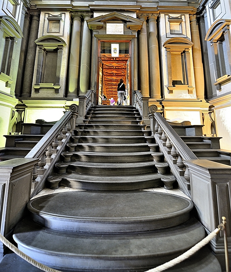
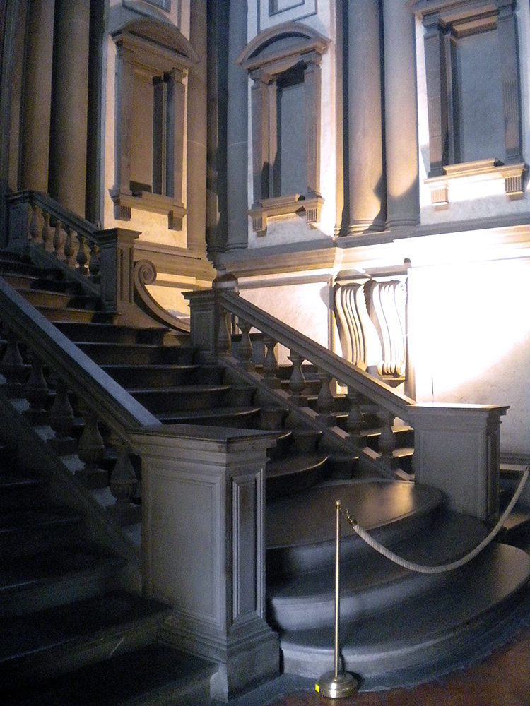
“IT’S GONNA EAT ME!” I have no better summary of the whiplash moment as one steps into Michelangelo’s vestibule. What is this sprawling black staircase oozing down at me like a lava flow? What is this vast dark space, crowded and empty at the same time? Why is the light so far away? How is this airy and gloomy at once? Things! Things all over, columns, niches, railings, frames, all crammed in too tight, so they seem about to burst out and spill all over you, like an overstuffed suitcase.
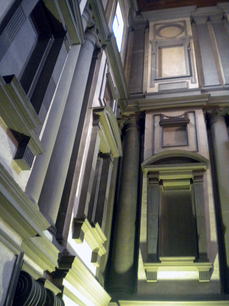
Photography cannot do it justice since so much of the effect is being suddenly surrounded by this on all sides. The more familiar you are with how architecture of the era is supposed to work, the more powerful the shock. Nor is the shock negative: the room is amazing, beautiful, harmonious, just also tense, overwhelming, alien. Right and wrong at once. At first one’s reaction is a mass instinctive “What the?!” but as you stay and start to think about it you realize how each individual feature is made of familiar architecture and yet makes no sense. These dense, paired columns are stuck inside the wall where they do nothing—the point of a column is to not have a wall. These aren’t columns, they’re column-like things trapped in a wall. These blank dents, they’re niches, with stands for sculptures that aren’t there and clearly are never supposed to be there. These blind windows, window frames around solid wall, there’s open air outside them, there is no reason to have rows of window frames without windows except that he wanted that, blind darkness where the shapes of the frames teach your eye to expect light. Why are these pediments fractured and jagged? Why do these frame struts remind me of an Egyptian tomb? What are these huge curving swirly things stuck into the wall? They don’t do anything? They just loom! Why do these three staircases merge into one? It doesn’t do anything useful!
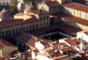
In fact, this whole enormous room is completely unnecessary. There is nothing in here except a set of stairs whose only purpose is to get you to up to where the main library is, yet the ceiling of this room is above the ceiling of the library, because he actually added an extra half story to it just so more architecture could be there looking menacing. This room is three times as tall as it needs to be, just so Michelangelo can fill it with terrifying stuff! Shock turns to awe. The fake architectural elements painted on the Sistine ceiling are now real, but purely as objects of imagination. The architect has broken free of utility entirely, and wields architecture as pure communication, aimed toward the single purpose of overwhelming all. Columns, windows and other forms are free to be anywhere, like poetry written in a language that doesn’t have required word order, so a poet can put anything anywhere for maximum impact.
The Laurenziana is not the library architecture I intend to complain about today. Rather I cite it as an example of successful architecture, which stuns and amazes, and achieves what it set out to. Michelangelo’s scaaary scaaaary staircase is gorgeous, shocking but gorgeous, like when an unsuspecting public first met Kafka, or Nietzsche, or Dangerous Visions, and came away staggering: “I didn’t know you could do that!” You can, and if you make Michelangelo angry enough, he will. One too many Medici commissions had fallen through, and he himself had to leave most of the library to assistants, arming them with models and sketches as he was dragged off yet again to Rome for yet more papal commissions which would inevitably go sour.
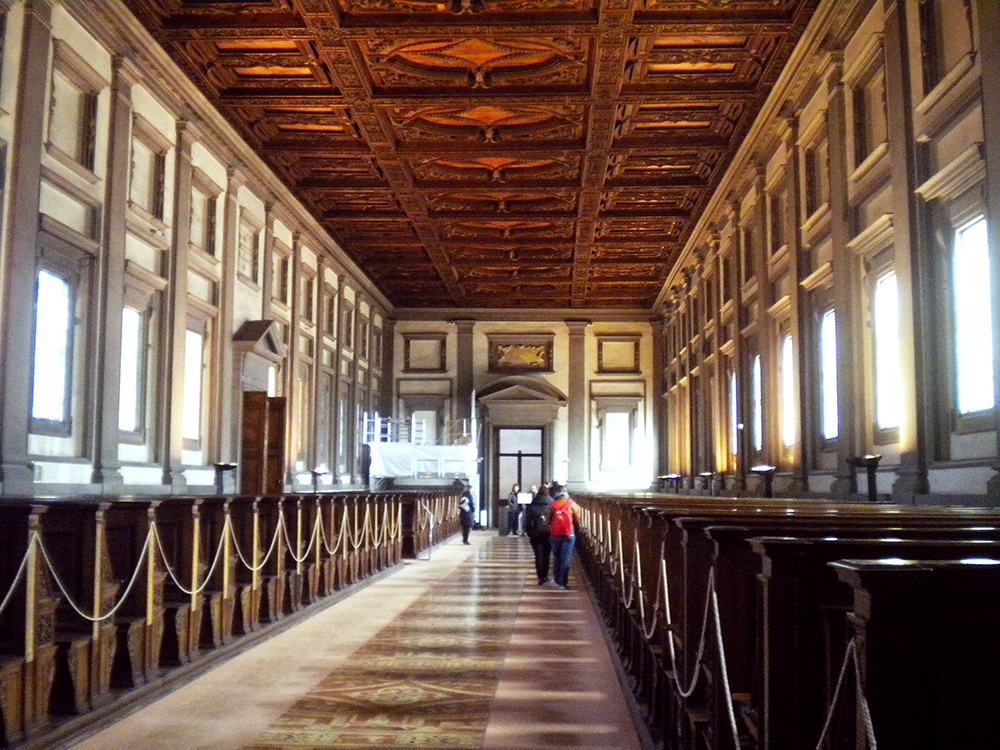
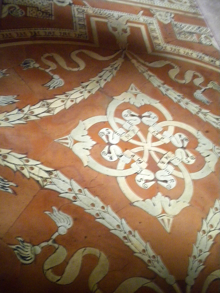
He also left us the reading room beyond the vestibule, a restorative paradise of symmetry and order, with warm stained glass and row on row of welcoming wood benches with the books on their chains ready for scholars’ hands. On the tiled floor and inlaid wooden ceiling, decoration with organic themes—garlands and scrolls with Medici slogans—counterbalances and soothes away the heartless, grim geometry of the vestibule outside.
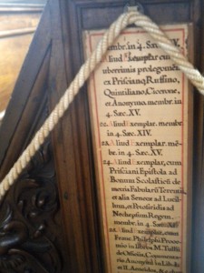 The books are no longer kept in the reading room, but in more protected quarters downstairs, so visitors can come into this part freely, and experience the three successive plunges into quiet cloister, looming vestibule, and heavenly reading room, and stroll along the seats where our humanist predecessors pored over the Virgil and the Lucretius and so many other wonders. A friend I went with once called it a secular pilgrimage site, and rightly so. The clumps of people who speak a dozen languages in awed whispers tiptoe along the tile with the same reverence and thrill of connection that I see fill people in St. Peter’s or San Clemente. Often someone stops to squat beside the lists posted on each bench, calling a friend’s attention to some especially beloved author: Lactantius, Porphyry, Averroes’ commentaries, Catullus, Theophrastus, Ficino. It is the opposite of a graveyard—inscriptions row-by-row of who survived.
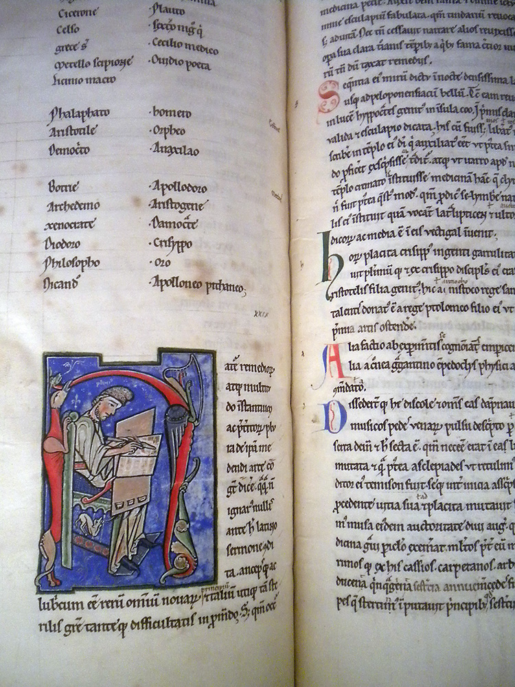
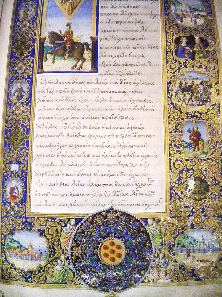
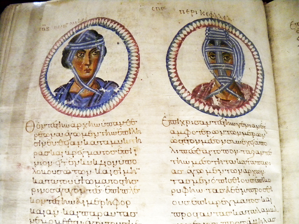
Beyond the reading room, a little museum area displays a rotating selection of the books themselves: Byzantine medical books, our oldest Virgil, illuminated Homer; and a little gift shop offers temptations including what may be the single best-thought-through piece of merchandising I have ever seen: a lens cleaning cloth featuring the illuminated frontispiece of Ficino’s translation of Plato, dedicated to Cosimo de Medici, so Neoplatonism can literally help you see more clearly.
Some fun treasures displayed at the Laurenziana museum (which is only open before noon):
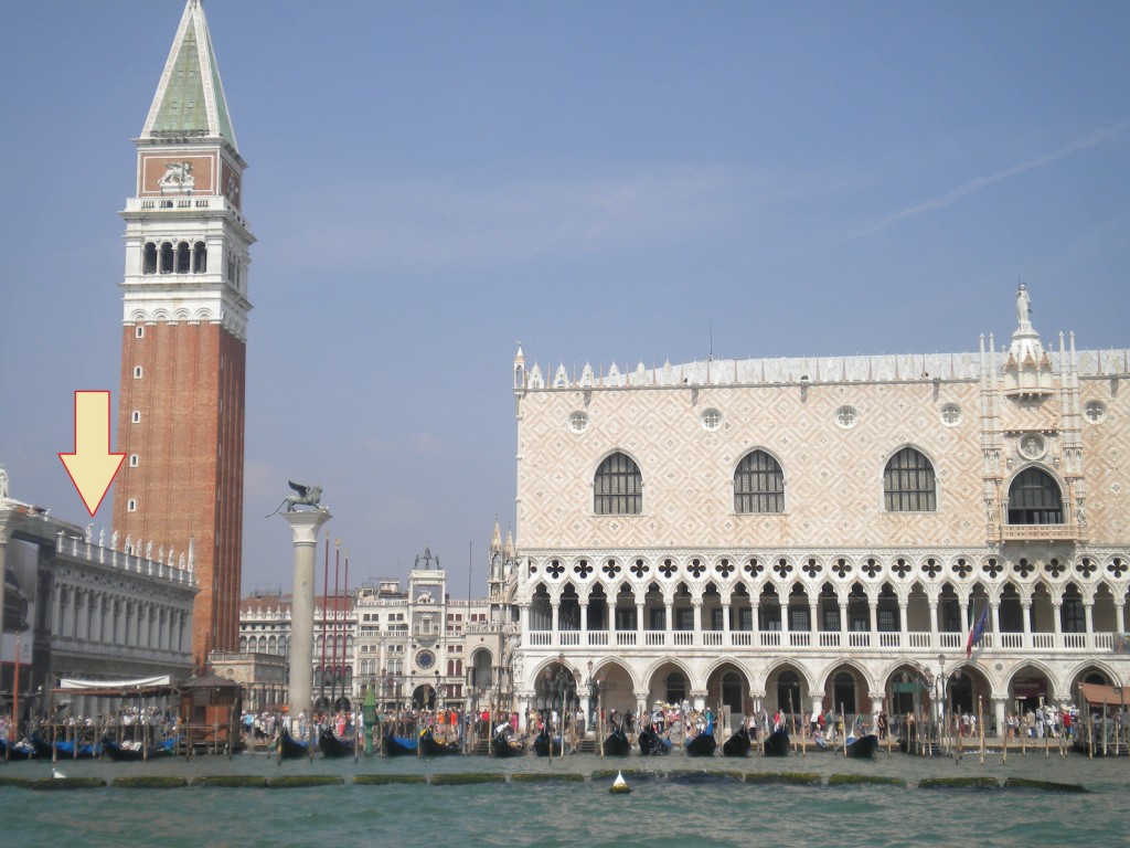
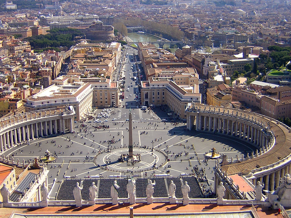
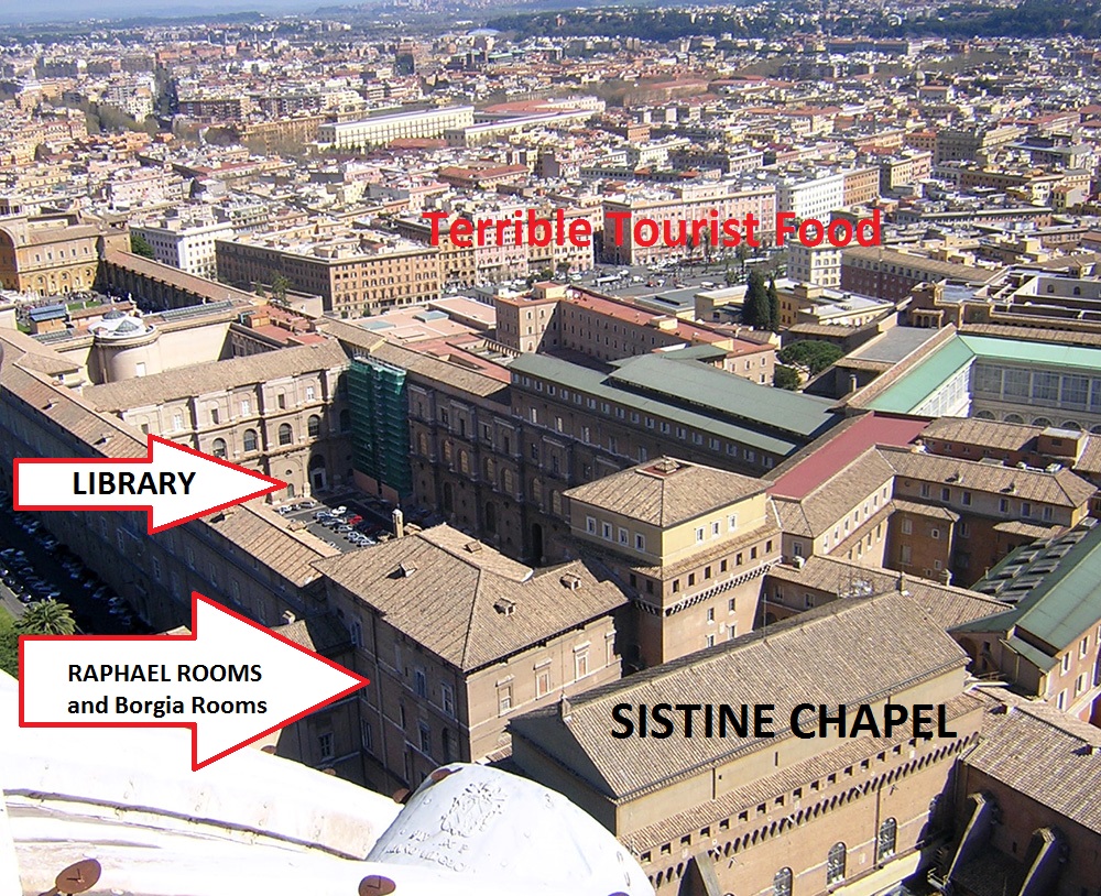
I have worked at many libraries similar to the Laurenziana: the Ambrosiana in Milan, the Marciana in Venice, the Estense in Modena, Oxford’s Bodleian Library, the Vatican of course; all grand historic buildings advertising their learned patrons with luxurious halls and stunning facades. The gorgeous old reading rooms of the American Library of Congress and Harvard’s Widener and Houghton Libraries achieve much the same effect. Others are housed in more modern buildings, the Villa I Tatti outside Florence which houses the Berenson Library, or the library of the Danish Academy in Rome which showcases modern Danish design. Some of the modern buildings are, I will admit, not particularly attractive, but places like the Cambridge University Library and the Roman Biblioteca Nazionale are at least comfortable and reasonably practical.

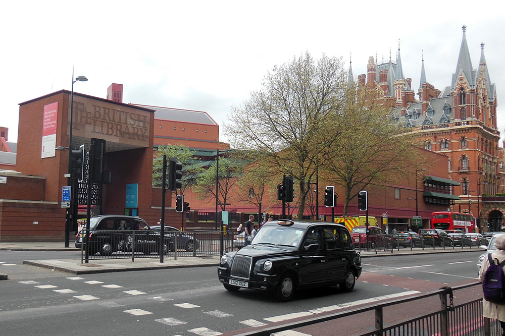 The prince of modern library buildings in my own experience is the British Library in London. A quick examination of it will provide a perfect, last point of contrast before we move on to the true subject of today’s post, a library so dreadful I have felt it necessary to show you others first, in order to help you understand the shock and dismay of we who have grown accustomed to spending our research hours basking in beauty only to be cast into dystopia.
The British Library is, to start with, conveniently located on the same block as the King’s Cross hub of London’s underground, in the heart of a city, a comfortable stroll down lively shopping streets and past seductive bookstores to the British Museum and the theater district beyond. It is surrounded by London’s signature layered architecture, samples of many centuries commixing amicably, like so many dog breeds rough-housing in a park. Its designers chose brick for the structure, in order to blend with the stunning historic St. Pancras Hotel next to it, augmented by a grand welcoming gate, and a pleasant courtyard with outdoor café and sculptures.

Within, the library is bright and airy, with several different dining options and well-labeled levels. Chairs of a wide variety of different shapes and types wait for the convenience of patrons of different body types who find different things comfortable. Card services are downstairs, but no card or ID of any kind is necessary to walk straight up the steps into the “Treasure Room” on the left, which displays a rotating selection of true prizes of the collection: original copies of the Magna Carta, the first draft of Alice in Wonderland, the Beowulf manuscript with the page proofs from Seamus Heaney’s modern translation displayed beside it, the first score for the Pirates of Penzance, Wilfred Owen’s poetry journal with Siegfried Sassoon’s hand-written corrections, Robert F. Scott’s diary, and dozens of other relics which make this free and open display room another worthy pilgrimage spot.
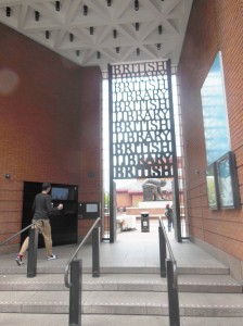 Closed stacks are a necessity at such a library, but a selection of several thousand of the most attractive volumes are displayed in a glass-walled interior tower within the structure, so you can see the giddy acres of gilded leather spines, while the rest of the comfortable space is decorated with informational posters about temporary exhibits on topics from sci-fi to propaganda, and whimsical bibliophile art, like the Book Bench and “That thing at the B.L. where you move your head back and forth and it does that thing.” “Eeh?” you say? Confusion is natural. Many a time I have tried to describe this thing to people who have never been to the B.L. and failed utterly, while with people who have been, without fail all I have to say is “You know, that thing, when you’re going down the stairs, where you go like this,” (bob head left and right) for the person to say, “Oh, yeah! That thing!” and bob their heads slowly back and forth the same way. Even photographs fail, but since amateur video technology has taken a leap forward in the last year, I can at long last coherently present to you what may be the most fun piece of bibliophile art in the world. Its actual title is “Paradoximoron,” (created by Patrick Hughes) but all are agreed it should forever be known as “That thing at the B.L. where you move your head back and forth.” (Below are two photos from different angles, then a video.)
Long could I sing the praises of the convenience and practicality of the British Library, but today is not a day for library anecdotes. Today is for architecture, and it is time now to face up to its dark underbelly.
Those who, like me, work on rare books often discuss libraries. When I tell a fellow specialist I am going to a particular city to do research, the instant question is, “Which library?” since Florence, Rome, Venice, London, and other great capitals house several major collections, generally including a main city library, a separate state archive of government documents, libraries of key noble families or monasteries, and one or more institutes which offer modern secondary sources, academic journals, and critical editions. Just as one can bond with a friend over shared experience of a favorite shop or restaurant, specialists bond over memories of the libraries where careers, discoveries, and even marriages are made.
When I tell someone, “I’m going to Paris for research,” I get the same question, but with a wholly different tone: protective, timid, scared, “Which library?” The veiled grief is the same which, in troubled times, might follow “Big news at the office today” with the tremulous question: “Good big news or bad big news?” Research in Paris can be great news: the Louvre, the bakeries, the Pantheon, and if one is fortunate enough to be working on books at the old Bibliothèque Nationale one can enjoy the same elegant gilt wood and stonework one expects, both of great European libraries, and of Paris, whose general city-wide style is elegant bordering on opulent, with occasional pockets of modern avant-garde and gothic grace.
But there is a fearsome alternative.
The new Paris Bibliothèque Nationale is one of the infamous failures of modern architecture. Located inconveniently far down a subway line near nothing in particular, it achieves the impossible: wasteland isolation in the midst of Paris itself. This is not the kind of avant-garde that is hated at first but then becomes an icon of its era, like the Eiffel Tower or the Centre Pompidou or Michelangelo’s Last Judgment. First I will show you. Then I will talk you through the depths.
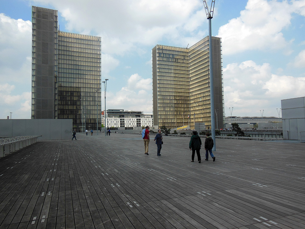
What are we looking at? We are right now, believe it or not, on top of the library. This sprawling, nearly football-field-sized sea of unpainted colorless wood planking is both the roof of the library, and its entrance, since the layout requires you to climb on top, so you experience a feeling of abandoned wilderness as the beauties of Paris vanish away below you, leaving you exposed to wind and sky. The complete absence of color enhances the feeling of post-apocalyptic desolation.
Four identical L-shaped towers of featureless glass rise from the corners. Their completely transparent faces reveal row upon row of identical interior spaces half-shielded by slanted barrier walls of unpainted wood, with occasional glimpses of mass-produced furniture providing the only hint of life. I have never seen a living person in these towers, and cannot start to fathom their purpose.
Bars of reflective silver-gray metal fence off the precipices around the outside of the raised wooden walk, and in the extreme periphery cubes of bush isolated within metal cages represent a vague homage to garden. In the center, emptiness, a cast rectangular pit opens down, and one can just barely lean far enough over a fence of silvery steel bars to glimpse the scraggly, dark tops of trees growing in the depths. It is down into this pit that we must descend to gain access.
The whole is so aggressively lifeless that the occasional passing pigeon becomes an exciting reminder of nature. Apart from the sky (which, on a merciful day, is blue) the only color are the enormous signs in brilliant yellow block writing labeling the two entrances OUEST (West) and EST (East), since otherwise the featureless symmetry of the structure makes it impossible to tell which way is which—the internal labyrinth enhances this confusion, and it is easy to emerge completely uncertain which way lies exit and which way nothing.
We descend via a long conveyor belt along a slanted entry ramp of colorless metal, which provides a better view of the spindly trees in the courtyard. This is no garden, but an attempt at something “natural”, with woodsy trees and unkempt brush growing underneath. But walled as they are on all sides by towering walls, the trees cannot get as much light or wind or water as nature intends, so they are all thin and wiry, and most require metal struts to keep them standing, creating a sickly parody, neither forest nor garden, artificial without artistry. It is easy to imagine a dystopian future in which this struggling false ecosystem is the last surviving preserve of “forest” maintained by gardeners who barely understand how trees are supposed to work on an Earth swallowed by the urban waste above.
We enter through glass doors and are examined by guards and instructed to deposit all our worldly goods in lockers, transferring the necessities to clear plastic boxes. This step is not uncommon—even the British library requires lockers and clear bags—but here one cannot lock things up personally. Instead we must hand our possessions over to brisk attendants who spirit them out of sight, giving us a numbered paper tag in either blue or yellow (or green, remember the green option). Stripped and de-bagged, and with our card in hand (if we brought the esoteric materials necessary to secure one) we are prepared to enter.
A cold steel turnstile brings us to mirrored metal doors, then into what feels like an airlock, a completely featureless claustrophobic metal cube with doors on both sides, so we must let the first set close before we can open the second. It is clear that they can lock them down in an emergency, but how or why, or what one would do if trapped within the airlock, is utterly unclear:
The area beyond is like nothing I have ever seen: a vast space, looming above and dropping deep below, through which an escalator descends, too tiny, like a single stalactite in the vastness of a cave. The only windows are so high above and so deeply set that they are no more than taps through which light emerges, and I could not honestly swear that it is sunlight and not some substitute.
Beyond the first escalator lies another, just as dizzying, though here at last the floor is in sight:
The walls of this dizzying area, which extends around a corner and down another two stories in one long chasm, are covered with (I kid you not) woven steel wire. These raw, unpainted metal walls, punctuated only by large metal bolts to hold them in place, reflect off the mirror-polished steel escalator framework to create an architecture not unlike the way I would imagine the interior of a robot. There are no familiar shapes or substances: no window frames, doors, moldings, not even walls or paint, so the rubber banister of the escalator becomes the only curved or friendly substance in the space, unless one counts the vastness of the industrial orange carpet on the distant chasm floor. In an interview, the architect said the woven wire walls were supposed to evoke the feeling of chainmail. Because nothing says “comfortable space to read and study” like a material designed to repel savage medieval combat.
On the chasm floor we face turnstiles, and must present our reader cards to be scanned and approved, or beeped at by irate machines which instruct us to go to a computerized kiosk and argue with a computer who has some grudge against our library card. Presuming we pass inspection, another silver airlock gives us admittance to the library itself. The interior space is one enormous rectangle of unbroken corridors, carpeted in brilliant red, while the rest is still glass and unpainted wood looming many stories above us, and stretching on and on and on. The computer has assigned us a random desk, hopefully in a subsection relevant to our research interests, and we wander the lengths of the box looking for the right letter.
The pit, or “courtyard”, with its “forest”, is directly beside us on the other side of the glass wall as we seek our spot, bowed trunks and breeze-tossed weeds a far cry from the Laurenziana’s citrus garden, but at least better than more steel. But we can’t reach it. There is no access from the reading room area to the courtyard—we can stare through the slightly dirty glass at life, but can’t actually emerge to stroll among the trunks or smell the leaves.
 The reading rooms themselves are also huge connected spaces, reaching the length of the library, so a cough from one desk reaches half the library, though the incomprehensibly high ceilings help absorb sound. Periodically the rows of numbered seats are broken up by help desks where sympathetic librarians wait ready to help you wrestle with the automated system. The work desks themselves are fine, and once Friend Computer consents to deliver your materials it is perfectly straightforward to do a day’s work, once one recovers from the entry process.
 Leaving is its own Kafkaesque process. One returns one’s library materials and heads out the lower airlock to the chainmail chasm, where the turnstile again scans your card and permits exit, or squeals its electric fury and demands that you return to fix some unspecified check-in error. If the computer decides to set us free, we emerge through another airlock, there to beg for the return of our worldly goods, and must wait in one of two lines depending on whether we received a blue or yellow ticket. We, in fact, received a green ticket, and mill around in some confusion until we collect twelve other people with green tickets and start clogging things until they consent to send a grudging drudge to take us to an area not usually used for this (or anything) where the green ticket bags have (who knows why?!) been transferred. We get our bag if we are lucky. If we are unlucky we receive confused instructions to descend again and try a different exit. The library is, as I mentioned, symmetrical, so there are, in fact, four chainmail escalator chasms, and one can easily choose the wrong end, emerging to an identical-looking check-out desk where you have to go all the way through the line to discover you are in a completely different place. But, if Fortune can peer through the wire walls enough to smile on us, we find the right exit and obtain our stuff (Beloved stuff! Look how not-made-of-metal it is! Look how it has colors! Like brown, and beige, and blue!). Now we exit past the guards, the glass doors, the steel rails that guard the tops of spindly trees, and ascend the (usually not actually switched on) conveyor belt to find ourselves deposited again in the colorless vastness of the wooden decking above. The overwhelming feeling, especially as everyone is fleeing at day’s end, is that this is not a space designed for humans to be in it. Or for life to be in it. Whatever unfamiliar intelligence this place was built for, I have not met it. The wise know when to flee.
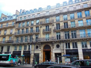
 Only upon returning to ground level, when the Parisian skyline and nearby fun façades and bustling streets return to view, does one grow calm enough to analyze this experience. On purpose, someone built this. This is not an urban wasteland generated by cost-cutting, or a sudden recession. This was a very expensive, high-profile public works project designed to display the pride of Francophone scholarship. And Paris did this! Paris! Paris, whose average street corner department store has woven ironwork and imperial grandeur. People who study architecture and urban planning know the details of the commission, the who and when and why of its construction, but the first-hand experience is just so dehumanizing that I cannot understand how any intentional act of human civilization—of Paris’s civilization—took some wood and glass and metal and created Orwell. And I am far from alone in my confusion. In fact, the whole neighborhood around the library is a little nexus of consolation for those doomed to approach it: a movie theater offers instant escapism, food carts bring Paris’s culinary richness, and human civilization shows itself most pointedly hilarious when, on the first corner one reaches after evacuating the wastes above, one finds a pub named “The Frog and British Library.” In other words, “Don’t you wish you were at the British Library?” Yes. Yes, I do.
But for all this, there is one metric by which the French Bib Nat is a bizarre success. I have long kept a joke ranking of libraries I use, rating them by how successful they are at preventing people from getting at books. This facetious metric helps me remain cheerful in the face of particularly impenetrable libraries, like the Capitolare in Padua, which is only open from 9 AM to noon on weekdays not sacred to saints the librarians particularly like (they like a lot of saints), and which so excels at protecting its books from people that it took me three visits to Padua before I managed to get in for a precious two hours and see two books. By this metric the Vatican is one of the world’s most successful libraries, and the British Library the absolute worst.
But there is a less joking side to this. In a perverse sense, people are the enemy of books: we touch them, rip them, bend their covers, get our oily finger pads all over them, etc. The safest book in the world is one sealed away in frigid, nitrogen-rich darkness, far from human touch. The two duties of the librarian, to protect the books and serve the patrons, are directly antithetical. I believe this is a big part of why some librarians are so hyperbolically gung-ho about digitization, since touching can’t hurt a digital book. The majority of librarians, of course, love readers and want books to be used, even though all are aware that use damages them. Especially in the case of rare books that can’t be easily replaced, libraries must seek a balance in which people use books a moderate amount, so the books can last while the work gets done. The Paris library achieves this balance to a near perfect degree, since it is so intimidating and inhospitable that no one ever, ever goes to work there unless it is absolute necessity. Only researchers who have to go will go, and if there is any way to avoid using those books everyone takes it. Result: productivity with minimal book use, ensuring maximum book survival. The balance might even be praiseworthy if it had been intentional. In fact, Michelangelo’s sinister Laurenziana vestibule achieves something of the same effect, since anyone who steps into it immediately flinches back, which certainly drives away some portion of visitors who have no acute need to brave the oozing stairs to reach the reading room above. Thus we have identified a powerful tool for protecting library collections: scaring off readers with terrifying architecture. Let’s hope it never catches on. If it does, I trust you’ll all help me track down the perpetrators and feed them to Michelangelo’s staircase.

