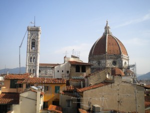
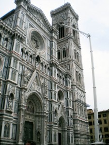
Good morning, Giotto!
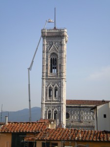
The city of Florence would like it to be known that 7:00 AM is the correct time to get up and admire Giotto’s bell tower.
Perhaps you didn’t hear me.
IT’S 7 AM! DONG!!! I’M A BELL TOWER! DONG!!! LOOK AT ME! DONG!!! YOU WEREN’T STILL SLEEPING WERE YOU? DONG!!!
Needless to say, sleeping in is an impossibility in an apartment a few blocks from, not one, but eight separate audible bell towers, which all ring with different degrees of force and verve at different times, all day. Every day. Especially Sunday. The main campanile, though, designed by Giotto and started in 1334, is the hefty one, and guarantees a long, productive morning out of everyone. Actually, the bell tower (or Campanile) was not finished to Giotto’s design, but he still gets credit, since he is, after all, the much-beloved heart and founder of Renaissance art.
Why?
Five minute art history lesson: amaze your friends and impress your parents by being able to tell at a glance the difference between Medieval and Renaissance art! Yes, it’s that easy.
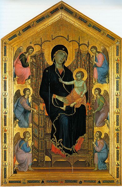
To explain why Giotto matters I will take you to the first main room of the Uffizi gallery to look at three identical altarpieces depicting the Madonna enthroned with child and angels. All derive from that era in which almost all art (I’m not talking 3/4, I’m talking 90%) consisted of nearly-identical, stiff iconic images of saints. In fact, it’s safe to say 50% of them are the Madonna and Child. This is an era of art that some people find beautiful but many find tedious and repetitive, and both camps are, in my opinion, right. It is also the perfect way to demonstrate what Giotto did, and why everyone considers him the beginning of Renaissance art.
Above is a lovely Madonna by Duccio di Buoninsegna, an excellent late medieval master. (Click for a bigger version). Note the beautiful and detailed patterns on the drapes behind the Madonna, rendered in elaborate colors and veined with gold leaf which would have glittered hypnotically in the church candlelight. It’s beautiful. Note too that Mary has pretty-much no anatomy. She’s a big blue blob with a knee, and stars on her robe (one of Mary’s attributes, since Mary is the Queen of Heaven so gets stars). The angels too are lovely with detailed wings, floating in a stack in non-space. And her throne, elaborately patterned, knows nothing of perspective. The whole thing is nearly-identical to a Byzantine icon.
Now, jumping up a few years:
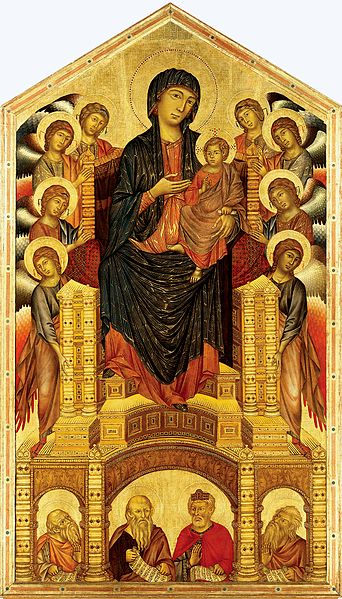
This Madonna, by the excellent and progressive artist Cimabue. New things are going on here. Mary has a lot more anatomy: feet, drapes outlined in gold. The angels, with their lovely wings, are not floating vaguely but are in front of each other as if actually in the same place. The throne has no formal linear perspective, but does have breadth due to being broader in the front than in the rear. This is again lovely.
Now, check out Giotto’s:
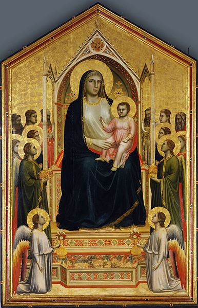
Houston, we have volume. Look at Mary’s body; she has a chest, weight. Look at the baby; you can tell how thick his arms and legs are. Look at the kneeling angels, how you can see the volume of their thighs. And check out the saints standing on either side: they’re standing in space. In a plane. Not just in front of each other but on an actual floor, like people standing in a room. Their halos are starting to get in the way too, setting the stage for the era when halos will turn from gold discs to smaller arcs, to make room for other objects occupying the same space. Look at their faces, how they have the proportions of real faces. Mary less than the others, but the angels’ eyes are in the vertical center of the head, their brows, chins, noses, all in correct proportion. If he had secretly snuck in a portrait of a real human onto one of those standing saints it would look the same. Look how the shading on the drapery isn’t just lines but actual shadow so it looks really 3-dimensional.
When you look at it by itself, yes, it’s another fairly monotonous painting of the Madonna, but with more realistic figures we can now move toward realistic space, realistic facial expressions, people interacting with objects, foreground, background, landscape, architecture.
With this we can have a Renaissance.
And with this you can literally glance at a painting, look at how the figures are proportioned, and tell the difference between something from the Renaissance and something that’s in the Medieval/Byzantine/eastern tradition (since, after all, they still make icons of Mary as a shiny blue blob, they just don’t do it much in Italy…)
And I didn’t make you get up at 7 AM to do it either. DONG!!!

