Posts Tagged ‘London’

Stage Blood and Jetlag, or an Ex Urbe Visit to London
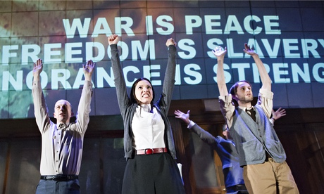
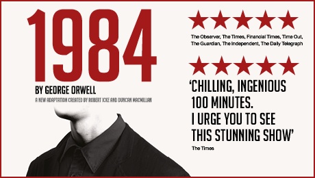
The 1984 stage play, one of this year's London highlights
The 1984 stage play, one of this year’s London highlights

The British Library often brings me here to London, to use the mass of early Italian books which were transported to the UK by the book collecting mania which was endemic in the wealthy classes in last two centuries, but this year the library has teamed up with Loncon (the London-hosted World Science Fiction Convention, or Worldcon) to bring many of my friends as well.  So while I travel (and don’t have enough reference books or tranquility to do justice to another post on skepticism) this seems a good moment to share what is half a reflection on my enjoyment of London, with something of a guide recommending activities, and half a series of of some of the more distinctive plays I’ve seen here.

My approach to enjoying London is very much a hybrid of my approaches to Venice and Disneyland, and has never failed to work out delightfully.

The gorgeous central book stack of the British Library
The gorgeous central stacks of the British Library

The Venice half of the strategy is to do everything I can to avoid having a plan.  I simply arrange cheap accommodations as close as possible to an exciting walkable center that’s easy to find again, and then wander at random.  Unpredictable intersections of twisting streets reveal layers of exciting architecture, monuments, vistas, fun people with creative fashions speaking many languages, and in the case of London (though not Venice!) excellent food.  When I stumble upon a museum I go in it; a church I have a look; concert I have a listen, and by avoiding having anything to do or anywhere to be I can just look and walk and look and walk until the long summer days stretch on into suppertime sunsets.

Don't forget the "Treasure Room" of the British library: in, up the stairs on the left, no card or payment, and within seconds you're looking at the Beowulf manuscript, the Magna Carta, Wilfred Owen's poetry notebook, the manuscript of Alice in Wonderland, Scott's diary... one of Lond's most overlooked highlights.
Don’t forget the “Treasure Room” of the British library: in, up the stairs on the left, no card or payment, and within seconds you’re looking at the Beowulf manuscript, the Magna Carta, Wilfred Owen’s poetry notebook, the manuscript of Alice in Wonderland, Scott’s diary… one of London’s most overlooked highlights.

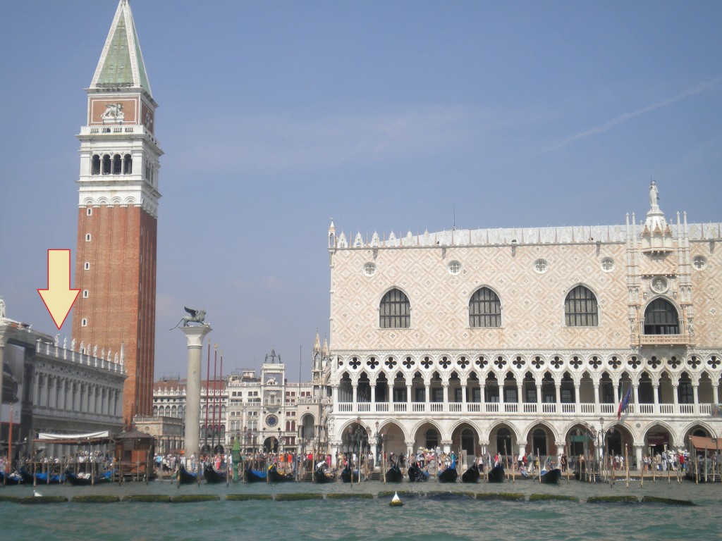
My usual Venice hotel is behind St. Mark’s Square because it’s the only thing in Venice one can reliably find, while my favorite London stop is the youth hostel directly across from the British Library. Being right by King’s Cross St. Pancras, the hosel is a short tube ride from everything, and a comfortable long walk southwest takes me past many of my favorite spots.  First are the specialty bookshops that cluster around the British Library like offshoots of a cypress tree (Judd Books and Gay’s The Word).  Next, the open park at Russell Square which is always packed with picnicers.  Next I pass the British Museum, where I might pop in to visit some Mesopotamian or Greek treasures, or just visit the strip of shops out front, to gaze at the lovely but staggeringly overpriced replica antiquities in It’s All Greek, or the real antiquities in the windows of the less-coin-specific of the two Coincraft shops, where I occasionally buy something small (I got a remarkably affordable 400 BC Attic little jug there, and a 1,000 BC Persian spearhead; they also have a bin of 1st to 4th century Roman Empire oil lamps for 45 pounds a pop, less if you get two and haggle, which for the sparkle of awe they bring to someone who’s never touched an artifact over 1,000 years old is definitely worth the price).

A few blocks further south I enter the theater district, stop off at the nerd mecca Forbidden Planet, and enter the warren of zigzagging streets surrounding Leicester Square and Covent Garden where I can spend a whole afternoon just walking.  The whole area is full of London’s signature layered architecture, crumbling stone and decorated brick and sparkling steel all in a pile together, with colorful woodwork and hidden alleys. I would swear that once I went down an alley and wound up in some kind of Chinatown, where I ate lotus buns and steamed bao, but I’ve never managed to find it again, and it’s just possible it might have been a dream.  Unable to find that again this trip, I contented myself with falafel, tapas, a Jamaican curried goat pie, and photoa hearty Egyptian street food called Koshari, which is a mixture of pasta, rice and lentils with chickpeas, spicy tomato, caramelized onions and spices, vegetarian but with that mix of heavy complex carbs and partial proteins that make it as filling and long-term sustaining as any meat—the shop is called Koshari Street (and they deliver!).  Oh, and gelato; two good gelato places in the area, La Gelateria (27 New Row) and a branch of the Italian chain Amorino.  If my path takes me southward far enough, I might stumble by accident on Trafalgar Square, and visit the National Gallery or Portrait Gallery, or stray as far as the river if my evening plan wants me to cross.  And if at any time I’m too tired to want to walk back, a saturation of underground stations will bring me back to King’s Cross.  (One detail relevant to this strategy: I seem to have the magic power that whenever I come to London the weather is beautiful and sunny the whole time, but the ‘wander outside’ plan may not work so well for those who don’t share this inexplicable blessing).
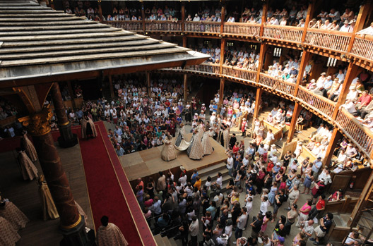
You can't take photos at the Globe (or other theaters) so I must rely on borrowed ones.
You can’t take photos at the Globe (or other theaters) so I must rely on borrowed ones.

The Disneyland half of my strategy involves tailoring this peaceful meander around maximizing the one unique activity which is so brilliant and unique that it’s worth tailoring everything else to get to do it as many times as possible.  At Disneyland this is Space Mountain.  In London it is going to the theater.  I count it a successful London visit if I’ve been to the theater more times than I spent nights, making intelligent use of matinees and how the proximity of many theaters makes it possible to catch one show in the afternoon and another the same evening, most days at least (Sunday and Monday present challenges since most of the shows are closed).  What makes this work so well is that all the plays are good in London, even the ones that aren’t.  What I mean by this is that the acting, direction and general production standards are so high that even when it’s a show which I might be skeptical about elsewhere I can rely on it being so well done that I’ll enjoy them anyway.  Over separate visits I’ve thoroughly enjoyed the brilliant writing and acting of The Tempest and The Importance of Being Earnest, the daring and precarious experiments of stage adaptations of The Lord of the Rings and 1984, the stagecraft spectacles of War Horse and The Lion King, even the formulaic nostalgia of Lady in Black and The Mousetrap.  And I always go to the Globe, consistently, unquestioningly, sometimes without even checking to see what show is on, I just know there’s a magical spot on the Earth where you can show up at 7 pm, give them 5 pounds and they’ll let you see Shakespeare, and it’s always good.  And it is always good.  Even The Taming of the Shrew and Love’s Labors Lost were thoroughly enjoyable, even though their combinations of unpalatable period sexism and general vacuousness make them hard to take in anything but an extraordinary performance.

Theater contributes especially to my jetlag strategy.  Going from West to East (US to Europe) I have found it most effective to take an overnight flight, get 2 or 3 hours’ sleep on the plane, and arrive in London early in the morning.  The essential step is to make sure I don’t nap that first day, exhausted as I am; if I can force myself to stay up until a good solid bedtime, 10 or 11 pm, then I can go to bed, get up at a normal time, and my clock is solidly reset onto London time thereafter with no further trouble.  But how to keep myself awake during that long draggy first day?  All I want to do is nap, but even a quick nap will doom me to sleepless nights and draggy days for close to a week.  Solution: theater.  I walk around the West End all morning, acquiring tickets for a double dose—matinee and evening shows—of theater, and thus can rely on writing, acting, sound and spectacle to keep me thrilled and awake until well after dark.  Depending on the day of the week the Globe can supply one or both, but this time I was saving the Globe shows (King Lear and Antony and Cleopatra) until friends joined me a couple days later, so I booked the stage blood double-whammy: 1984 followed by Richard III.

18853_full

The first was a new stage adaptation of 1984 by Robert Icke and Duncan Macmillan, in London for a short run, and excellent.  Powerful.  Vivid.  When I close my eyes now I can still see Winston in the chair with OBrien looming over, against the stark glowing white walls of Room 101.  And the agony on Winston’s face.  I was sufficiently impressed that I bought tickets to see it again with friends, and returned the next day to deliver a letter to the cast expressing my enthusiasm, though the playwright deserves it too.  The script and structure made great use of the fact that we in the audience all know the story already, know what’s coming, know that striking girl in the red sash has to be Julia before anyone speaks, and know where it has to end.
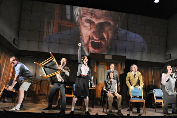
2minutesThe adaptation blurs time, using repeated actions and phrases and glimpses of thing out of order.  Winston hears O’Brien’s voice already interrogating him in his head long before he is taken to the Ministy of Love, a blur which creates a metatextual framing: is this the real, live Winston experiencing these events, or are we already in Room 101 and these are his memories breaking down under the pain?  And the play also incorporates Orwell’s own framing story, the final section of the novel which is written as if by someone from a later period after the 1984 regime has fallen, who is examining Winston’s account as an historical document; by presenting this early in the play, the adaptation further blurs time: are we seeing live events, Winston’s decaying memory’s, a later period’s ideas of Winston’s account, or both being read by us, the real live reader?  The mixture lets us experience all of these layers at once, while all of them are trapped in the same inevitable story. As we watch the events march inevitably forward we are all—Winston, Julia, O’Brien, Orwell, the actors, the viewer—equally aware what room we will soon enter, or in a sense have always already entered.  Reuse of actors, most of whom play numerous characters over the course of the performance, highlights in a literal physical sense how the whole populace of Orwell’s dystopia is complicit in the horror that enslaves them, a dystopia made of its people, even Winston as he turns up to work each day to delete the records of people who have been erased, as he will be erased in turn.  The play has no intermission, no break or escape, which I think was a wonderful choice, and gave it a powerful momentum.  The live enactment of the Two Minutes’ Hate left one deeply terrified of human beings (it had rather the same effect as the room full of Otto Dix I once saw in a Dada exhibition), and Room 101 itself was… well, one of these rare cases where something has infinite buildup and then lives up to that buildup completely, by being precisely what it always had to be.  And they have made such great advances with stage blood.
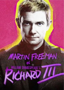
MF-Rich-III-posterTen times as much stage blood, sloshed in all directions and over all characters, gave the evening show of Richard III all the crowd-thrilling power Shakespeare intended.  I hadn’t bought a ticket in advance and tickets were almost unachievable, because it was both very good by a very good director (Jamie Lloyd) and starred Martin Freeman (Watson in Sherlock; Bilbo in the Hobbit movies), which added to the general population of Shakespeare and Theater lovers a 40% additional attendance by bouncy Sherlock fangirls.  Seats were scarce, but arriving two hours in advance made me first in line for the last-minute returned tickets, providing a fascinating opportunity for polyglot as I and a Sweedish actress and two French Sherlock fans cooperated to manage taking turns running off for sandwiches with our mixture of imperfect languages.  Ten minutes before the show my patience was rewarded.  I rarely enjoy Shakespeare re-set in modern costume, but this was a delightful exception, set almost in the round with a stage crammed with 1950s-ish office furniture—desks with huge brown typewriters and avocado green rolling chairs—recasting the historical setting so that the aftermath of war was not a distant civil war but the wake of WWII.  This gave a visceral immediacy how terrible it is to see the hard-earned peace turned into war again by Richard’s selfish schemes.  The violence too felt very modern and therefore real, and the production succeeded in something I have seen several attempt: using contemporary violence tropes from Hollywood to recreate the feeling a richard-iii-martin-freeman-and-lauren-oneil-photo-marc-brennerperiod play would have had of showing the audience violence that feels like the violence we see in real life instead of something gilded and distanced by antiquity (a production of Webster’s White Devil which I will shortly see in Stratford is trying the same).  In some of the murders the audience could tell from the stage setup and general knowledge of Hollywood how the murder had to end, and I felt myself almost silently cheering for the murders to come as expectation’s tension ripened inside me.  Martin Freeman proved an amazing Richard, perfectly balancing his endearing and repugnant facets to woo the crowd enough but not too much, playing with audience complicity.  Also remarkable was the fact that, instead of cutting Margaret’s curse (as so many productions do when you haven’t just sat through Henry VI so don’t really care about her), this production expanded it into a centerpiece which dominated the story and balanced against Richard like a second real human power at work in the story instead of events being Richard vs. Fate, as it often feels, or Richard vs. the-trope-that-villains-aren’t-allowe- to- win.  I didn’t have one of the seats where you actually got spattered with stage blood, but I was offered one, and I was tempted.  Needless to stay, it kept me awake and delighted until a healthy bedtime, and I promptly bought tickets to see it again with friends as well.
Large-Tile-15-Henry-IV-Part-2-470x270
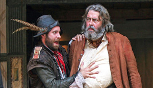
Falstaff and Pistol, in Henry IV pt. 2

Despite all this, I fully expect the best theater I see in London this trip to still be coming up: Shakespeare at the Globe. I always unquestioningly see everything that’s on at Shakespeare’s Globe, no matter what it is.  Standing tickets are only five pounds (and have the best view by far).  Recent productions have concentrated on the comedy, even in tragedies and historical plays, since there are always humorous scenes or scenes with clowns and comic characters.  Modern directors tend to try to play these scenes for pathos, seriously or as social commentary, but the Globe is instead doing what my studies of period theater confirm is more likely to have been the original style: playing up the humor to the maximum, with the addition of lots of physical improvisation in the style of Commedia dell’Arte.  The result turns what are often the boring (or excluded) scenes into refreshing and hilarious windows on period humor, lively and intense and incredibly entertaining. For those curious, I cannot recommend enough the DVD of their Henry IV, which has such a stunningly entertaining Falstaff that many sections which had never made much sense in any other production suddenly come together as rollicking and wonderful centerpiece scenes.
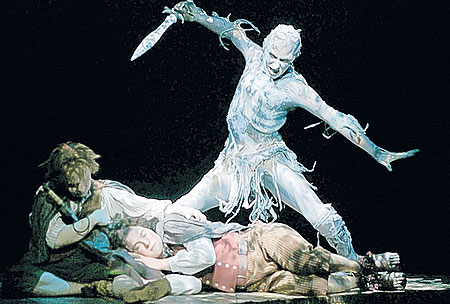
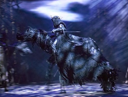
lordrings_450x304And since I’ve mentioned it, I should finish by sating your curiosity: Yes, there was is a The Lord of the Rings stage musical; no, it was not a particularly good plan.  I recently learned it’s going to come back and have a world tour starting in 2015, but the version I saw in London previews in 2007 was—much like the achievements of Voldemort—terrible, but great.  I saw it on a ten pound discounted last-minute ticket, and morbid curiosity has never been better rewarded.  Some parts were brilliant.  Hobbiton and Bilbo’s birthday party could never have a better setting than a lively, colorful stage full of cheerful, dancing hobbits and raucous music.  The sets and costumes spared no expense.  Gollum was magnificent, incredible physical acting and great writing too; every time Frodo had a song Gollum would repeat it in an eerie minor key, to great effect, and the actor received a well-deserved standing ovation.  The stage itself was complicatedly segmented so they could raise and lower bits of turrain to create mountains and hills and towers, and the long march across the mountains looked every bit as exhausting as it should be.  Shelob was also incredible: they blacked out the house completely except for a tiny spotlight on Frodo, and had an enormous puppet but all you could see were the vague shadows of the legs just moving in the edge of the light, with the body always invisible, far more terrifying than anything CG has produced.  Orcs came out during intermission to terrorize the audience, which was fun, using weird stilts, which was… weird.  And the horseback Nazgul were excellent, great horse frames and billowy black cloaks which were genuinely awesome… almost as awesome as the gazelles from The Lion King musical… but then again a Nazgul inherently is about fifty jillion times as interesting as a gazelle, so perhaps that isn’t saying much, or perhaps it says more about Julie Taymor’s skill than about the play.
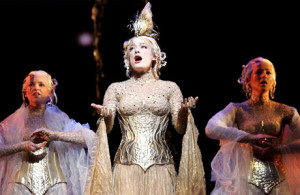
lordwolf460You may have sensed that I’ve rather run out of the brilliant facets of the musical and am approaching the more… well…  I applaud the decision not to have Gandalf sing at all.  I do not applaud the decision to have Gimli sing, and speak, in a weird high squeaky voice all the time.  Nor the decision to have Legolas make bizarre hyperstylized grand gestures every time he spoke, as if he was constantly doing sign language in an incomprehensible elven gesture code.  Nor other things.  For example, some people like the costume Galadriel wears in the films, or in this piece of art, or that piece of art, and some people hate them, but no matter what factions we usually fall into regarding Galadriel costuming I think we can all agree that Gold Sparkly Boustier is not really anywhere near anything one could ever possibly… I mean… how?  Why?  Help…? Galadriel was, in fact, a lot of the centerpiece of what made the show… odd.  You see, the trilogy has a lot of great characters, but it doesn’t actually have a lot of female characters, and those it has don’t have a lot of page count.  But musicals like to have lots of singing, and like to have a flashy female lead people care about to put on posters and promote.  So they wanted lots of singing parts for a woman, one woman, consistently throughout the story, even during the long stretches where there aren’t any.  So they picked Galadriel, and had her have songs.  Lots of songs.  Lots of songs all the time for no reason.  Frodo and Sam would be trudging along through Mordor dum-de-dum-de-dum and Sam would say, “Hey, Frodo, remember that time we met Galadriel?” and Galadriel would pop up *BWOOSH* from behind a rock and suddenly have a song, and then vanish again, leaving the audience (and the hobbits) in a state of bewildered shock, at least until Gollum came along to reassure us that we were back to our regularly scheduled one-ring-mindgames.
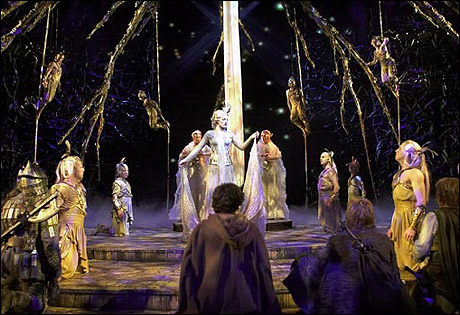
lotrclose460In case you were wondering, they couldn’t use Eowyn because there was no Rohan.  They cut Rohan.  They went straight from elves & co. to Minas Tirith and spidertime with nothing in between.  I understand why: you may have noticed that the Lord of the Rings is very long, and difficult to reduce to the length of a two-ish-hour stage musical.  But if you cut Rohan the whole thing becomes remarkably more efficiant, and you can turn the audience out on time while still having arguably done at least the beginning and end of the whole epic.  It was rather surreal but fascinating from a perspective of how it made me re-analyze the structure of the whole thing. That is, when sudden, inexplicable Galadriel wasn’t there to give me mental whiplash. Or Legolas making incomprehensible hand gestures. In fact, the elves in general were problematic. There were some we saw strolling around in long dignified robes, while others in the same place (Lothlorian I think) were dressed like Peter Pan and Tinkerbell hanging from vines swinging around like tarzan, which is, in the abstract outside of Tolkien, acceptable elf presentation, and I could even see someone thinking it was a good idea to make the musical’s elves like that, but not to have BOTH those AND dignified long-robed Tolkein elves together, it was like having an anime character walk into a Pixar film.  In the end I was very glad I saw it becuase it was an undeniably entertaining evening, and it’s certainly been fun describing it to people for the last seven years, but if someone asked me “Was it good?” I would definitely answer: “No.  But it was great!”  (And a great remedy for jetlag).

(A final note: thank you all for being patient this summer. I know my posts have been infrequent, but in addition to extensive travels and preparation to move from Texas to Chicago, this patch of silence has resulted from my intensive work finishing up 50 pages of carefully researched liner notes about Viking culture and mythology which will be printed in the libretto of my Norse myth a cappella song cycle (which you can pre-order here if you want to read them), and I’ve also been working hard finishing up the CD and DVD, preparing for my book launch next month (Reading Lucretius in the Renaissance), and doing many other sorts of work and writing. So the silence has served the greater good, but I will do my best to pick up the pace in fall after my move. And if you want to read something else right now, I have a new post up on Tor.com about whether or not female Thor should count as a Disney Princess. Enjoy!  And, for all those who will be at Worldcon, do drop me a line – I’d love to see you.)

The Scariest Library

The Sistine Chapel.
The Sistine Chapel.

I am going to spend the next 5,000 words complaining about library architecture.  Let’s see if I can keep you excited.

(NOTE: This post contains many images, so you may want to read it on a large screen.  It also includes Renaissance paintings with nudity, so be prepared.  Also, I am happy to report that my Kickstarter was a great success and raised a over 200% of its goal.  This will let me organize more performances and other expansions of the project.  Many thanks to the readers who chipped in.)
Michelangelo was a profoundly angry person.  Manifold grievances accumulated over his unreasonably long life: against picky, stingy, and fickle patrons, against incompetent suppliers and cracked marble, against rival artists and their partisans, against ungrateful  and ambitious students, against frustrated love and the Renaissance criminalization of homosexuality, against manipulative popes and his Florentine homeland which never did enough to protect him from them, against lawsuits over fees and contracts whose endlessness swallowed years of productivity, against painting, which he kept getting sucked into even though he hated it (Michelangelo’s bumper sticker: “I’d Rather Be Sculpting”), not to mention against plague, famine, war, debt, Borgias, Frenchmen, Pisa, and all the usual butts of Renaissance Florentine hatred.

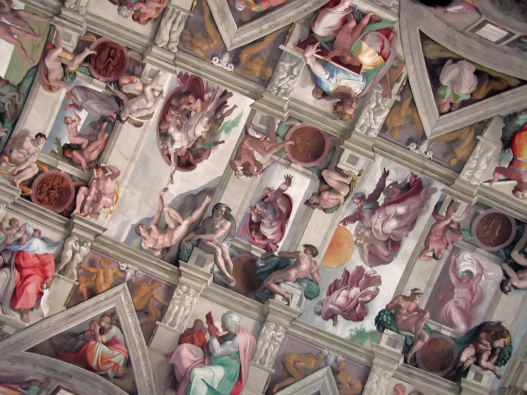
We see Michelangelo’s accumulated wrath in late works, like the Last Judgment in the Sistine Chapel.  The much earlier Sistine ceiling (1508-12) is a coherent progression of Old Testament scenes framed by luxurious painted fake architectural elements covered with naked men lounging around in pleasant poses that would be easy to carve out of marble (“See what I’d rather be sculpting!”).  It has strange elements, among them the fact that each biblical scene is held up by four naked men (“Look what I could sculpt!”) sitting on pillars painted to look like carved marble held up by two more naked men (“I could use marble!”) flanked by other naked men made to look like gilt bronze (“Bronze is great too!”), for a ratio of sixteen gratuitous naked men to each Bible scene (“Please let me sculpt something!”).
This is actually a featureless vault.  All the moldings and structures are Michelagenlo's invention, imagining architecture he would enjoy creating (and covering with naked men).
The Sistine ceiling is actually a featureless vault, not flat but smooth-ish, curved subtly by the underlying structure but about as flat as it was possible to make it. All the moldings and structures you see here are Michelangelo’s invention, imagining on a flat surface the architecture he would enjoy creating (and covering with naked men).

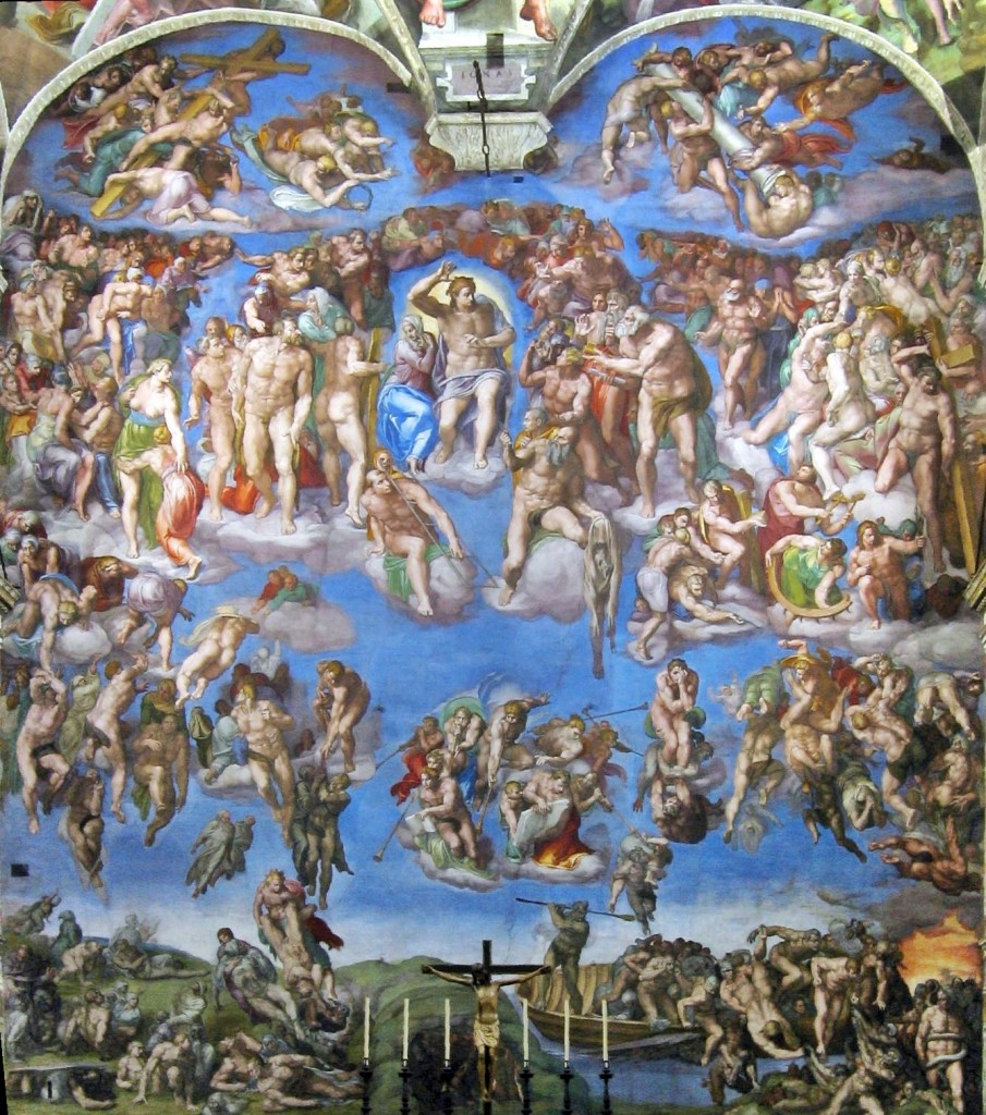
Strange and novel as it was, the Sistine ceiling was a brilliant and comprehensible expansion of the artistic ingredients of its era, one which all comers could understand and enjoy.  It was instantly hailed as a masterpiece and much admired and praised, and it instantly made complex painted fake architecture the standard vogue for fresco ceilings, displacing the popularity of the old blue-and-stars.  In contrast, Michelangelo’s Last Judgment on the altar-side wall of the chapel, painted more than twenty years later (1536-41), is a chaotic ocean of exaggeratedly muscular bodies massed without order or structure, and even the most beloved Spot the Saint stars are barely identifiable.

Il_Giudizio_Universale

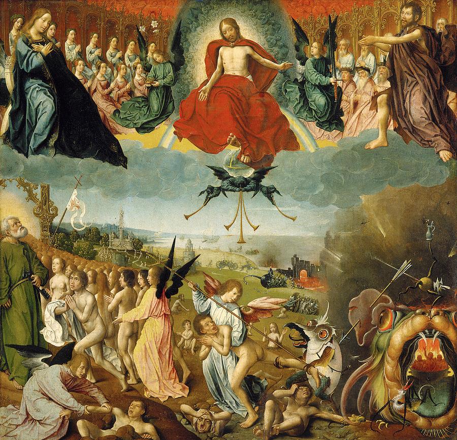
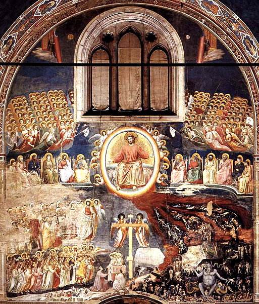
Here, for reference, are a couple examples of more standard Last Judgments.  Note the traditional layout: Christ the judge in the center, with Mary at his right and John the Baptist at his left.  On either sides, ranks of the blessed watch in prayer and reverence, usually with Peter and Paul prominent among them.  Below, tombs are opening and the dead emerging, and on Christ’s right (our left) the blessed are being raised to Heaven, while on the left the damned are led off to Hell.

Last Judgment

the-last-judgement-jan-ii-provost

lastJudgmentGiotto

Michelangelo’s is radically different.  Calm, ordered structure has been replaced by a sea of chaotic, disorganized clusters of figures, and masses  of muscular flesh.

Michelangelo_-_Cristo_Juiz

Easy-to-recognize figures fade into the muddle.  Here, for example, are some Spot the Saint friends in familiar forms, and in his:

JohnTheBaptistDetail

 SaintPeterDetailSistine

Lorenzo

Catherine

MichelangeloDetail

We now recognize that Michelangelo’s Last Judgment is a masterwork, and while individual modern people may like it or not depending on taste, we do not, like its original patron, find it so terrifyingly challenging that we want to paint it over, but we can certainly see why it shocked people as it did, and sometimes still does.

The Sistine Chapel is not a library, but I present this sketch of Michelangelo’s rage to help you understand the vestibule into which we are about to stray.

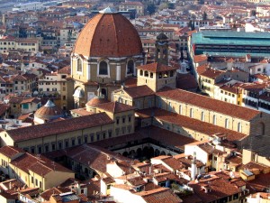
Florence's church of San Lorenzo, built by the Medici, with attached library.  The big dome is a later Baroque addition.
Florence’s church of San Lorenzo, built by the Medici, with attached library. The big dome is a later Baroque addition.

The Laurentian Library (Biblioteca Laurenziana), where I often work, was commissioned by the Medici in 1523.  With their second pope (Clement VII) solidly enthroned and Florence subdued, they wanted to add the world’s most sophisticated library to the already stunningly sophisticated architectural masterpiece which was the neoclassical Medici church of San Lorenzo.  The library had many goals—to entice scholars, safeguard the collection, glorify the city—but above all the project aimed to ensure that the Medici’s famous collection of rare books and scholars was suitably displayed, an advertisement to all visitors that they were Europe’s most learned noble house (“We’re nobles now! We bribed the right dudes!”).  Petrarch’s successors had spent over a century filling Florence with rare classics and commentaries from the far corners of the accessible Earth, and time and wealth funneled these into Medici hands.  Thus, the Laurenziana at its birth was staggeringly close to being what humanists had dreamed of: a new Alexandria, collecting ancients and moderns, pagans and Church Fathers, poets and clerics, Greeks and Latins, even Hebrew sources and many translated out of Arabic, assembled and organized for the use of a newly-learned world.  Such a gem deserved a worthy jewel box.

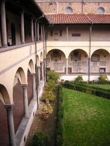
LaurenzianaWhen Michelangelo was commissioned to take on the San Lorenzo library, his patrons wisely instructed that he leave intact the mathematically-perfect neoclassical external structure of the church, and its elegant cloister.  All Michelangelo’s additions are internal, the layout of windows and benches, panels and decoration.

Reached by an unassuming door to the left of the church façade, the cloister remains to this day a welcoming and peaceful haven, whose cool, citrus-scented air washes away the city’s outside bustle.  This architectural vocabulary was familiar to any Renaissance visitor, with the rows of pillars and the single central tree which formed the heart of any monastery, though with slightly more perfect ratios, giving it a neoclassical edge.

Thus it is with an air of awe, comfort and anticipation that our Renaissance visitor ascends the steps to the upper floor to enter the famous library.

Exposici—n

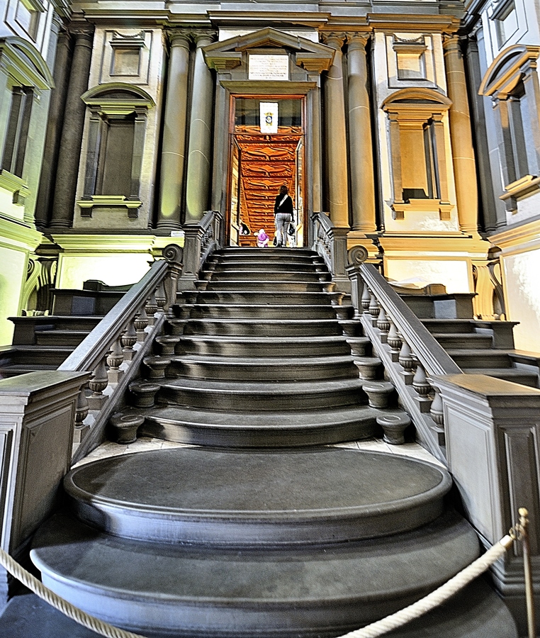
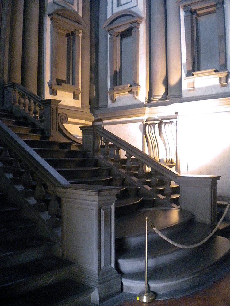
“IT’S GONNA EAT ME!”  I have no better summary of the whiplash moment as one steps into Michelangelo’s vestibule.  What is this sprawling black staircase oozing down at me like a lava flow?  What is this vast dark space, crowded and empty at the same time?  Why is the light so far away?  How is this airy and gloomy at once?  Things!  Things all over, columns, niches, railings, frames, all crammed in too tight, so they seem about to burst out and spill all over you, like an overstuffed suitcase.

November2011 179

November2011 177

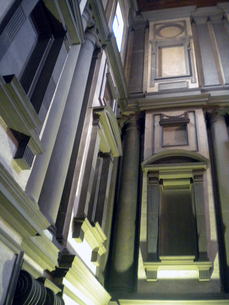
 Photography cannot do it justice since so much of the effect is being suddenly surrounded by this on all sides.  The more familiar you are with how architecture of the era is supposed to work, the more powerful the shock.  Nor is the shock negative: the room is amazing, beautiful, harmonious, just also tense, overwhelming, alien.  Right and wrong at once.  At first one’s reaction is a mass instinctive “What the?!” but as you stay and start to think about it you realize how each individual feature is made of familiar architecture and yet makes no sense.  These dense, paired columns are stuck inside the wall where they do nothing—the point of a column is to not have a wall.  These aren’t columns, they’re column-like things trapped in a wall.  These blank dents, they’re niches, with stands for sculptures that aren’t there and clearly are never supposed to be there.  These blind windows, window frames around solid wall, there’s open air outside them, there is no reason to have rows of window frames without windows except that he wanted that, blind darkness where the shapes of the frames teach your eye to expect light.  Why are these pediments fractured and jagged?  Why do these frame struts remind me of an Egyptian tomb?  What are these huge curving swirly things stuck into the wall?  They don’t do anything?  They just loom!  Why do these three staircases merge into one?  It doesn’t do anything useful!

Michelangelo_Firenze_Biblioteca Laurenziana 2

There is no need for this!
There is no need for this part to be extra tall!

In fact, this whole enormous room is completely unnecessary.  There is nothing in here except a set of stairs whose only purpose is to get you to up to where the main library is, yet the ceiling of this room is above the ceiling of the library, because he actually added an extra half story to it just so more architecture could be there looking menacing. This room is three times as tall as it needs to be, just so Michelangelo can fill it with terrifying stuff!  Shock turns to awe.  The fake architectural elements painted on the Sistine ceiling are now real, but purely as objects of imagination.  The architect has broken free of utility entirely, and wields architecture as pure communication, aimed toward the single purpose of overwhelming all.  Columns, windows and other forms are free to be anywhere, like poetry written in a language that doesn’t have required word order, so a poet can put anything anywhere for maximum impact.

The Laurenziana is not the library architecture I intend to complain about today.  Rather I cite it as an example of successful architecture, which stuns and amazes, and achieves what it set out to.  Michelangelo’s scaaary scaaaary staircase is gorgeous, shocking but gorgeous, like when an unsuspecting public first met Kafka, or Nietzsche, or Dangerous Visions, and came away staggering: “I didn’t know you could do that!”  You can, and if you make Michelangelo angry enough, he will.  One too many Medici commissions had fallen through, and he himself had to leave most of the library to assistants, arming them with models and sketches as he was dragged off yet again to Rome for yet more papal commissions which would inevitably go sour.

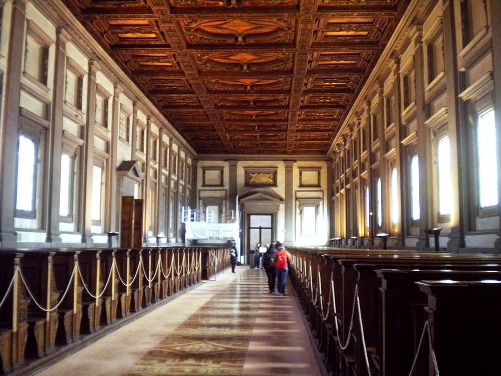
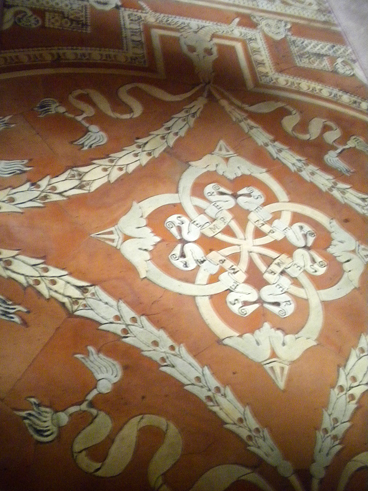
He also left us the reading room beyond the vestibule, a restorative paradise of symmetry and order, with warm stained glass and row on row of welcoming wood benches with the books on their chains ready for scholars’ hands.  On the tiled floor and inlaid wooden ceiling, decoration with organic themes—garlands and scrolls with Medici slogans—counterbalances and soothes away the heartless, grim geometry of the vestibule outside.

 November2011 149

November2011 157 - Copy

LaurenzianaFloor

November2011 161The books are no longer kept in the reading room, but in more protected quarters downstairs, so visitors can come into this part freely, and experience the three successive plunges into quiet cloister, looming vestibule, and heavenly reading room, and stroll along the seats where our humanist predecessors pored over the Virgil and the Lucretius and so many other wonders.  A friend I went with once called it a secular pilgrimage site, and rightly so.  The clumps of people who speak a dozen languages in awed whispers tiptoe along the tile with the same reverence and thrill of connection that I see fill people in St. Peter’s or San Clemente.  Often someone stops to squat beside the lists posted on each bench, calling a friend’s attention to some especially beloved author: Lactantius, Porphyry, Averroes’ commentaries, Catullus, Theophrastus, Ficino.  It is the opposite of a graveyard—inscriptions row-by-row of who survived.

Beyond the reading room, a little museum area displays a rotating selection of the books themselves: Byzantine medical books, our oldest Virgil, illuminated Homer; and a little gift shop offers temptations including what may be the single best-thought-through piece of merchandising I have ever seen: a lens cleaning cloth featuring the illuminated frontispiece of Ficino’s translation of Plato, dedicated to Cosimo de Medici, so Neoplatonism can literally help you see more clearly.

Some fun treasures displayed at the Laurenziana museum (which is only open before noon):

November2011 074 - Copy

November2011 078

November2011 085

Venice’s Marciana library. Certainly passes the architecture test.

I have worked at many libraries similar to the Laurenziana: the Ambrosiana in Milan, the Marciana in Venice, the Estense in Modena, Oxford’s Bodleian Library, the Vatican of course; all grand historic buildings advertising their learned patrons with luxurious halls and stunning facades.  The gorgeous old reading rooms of the American Library of Congress and Harvard’s Widener and Houghton Libraries achieve much the same effect.  Others are housed in more modern buildings, the Villa I Tatti outside Florence which houses the Berenson Library, or the library of the Danish Academy in Rome which showcases modern Danish design.  Some of the modern buildings are, I will admit, not particularly attractive, but places like the Cambridge University Library and the Roman Biblioteca Nazionale are at least comfortable and reasonably practical.

Oxford’s Bodleian library. The current reading rooms have been moved, but one still gets to savor kings and gargoyles.
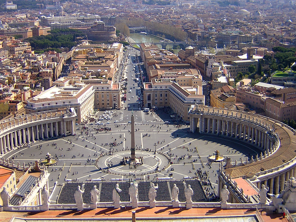
I took this photo standing on top of the dome of St. Peter's.  In a few seconds I will turn slightly left...
I took this photo standing on top of the dome of St. Peter’s. In a few seconds I will turn slightly left…
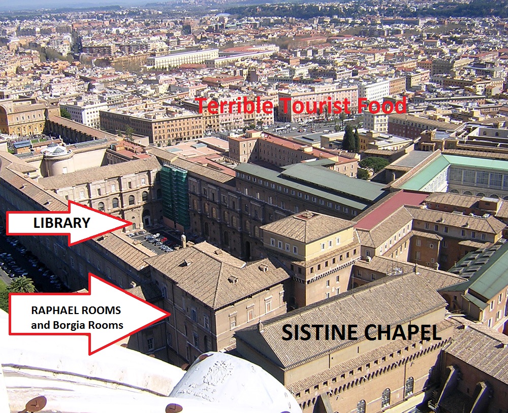
VaticanLibraryVoiewLabeled
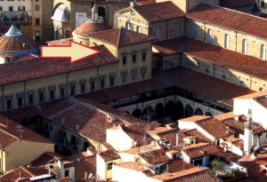
And there is where I have to go to work when it’s Library day.

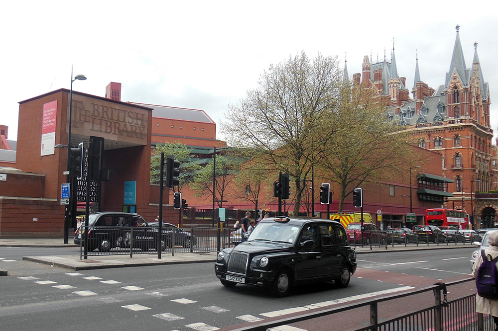
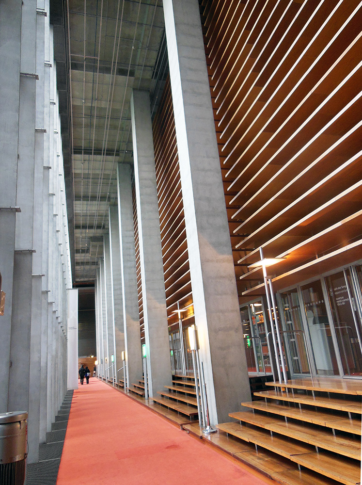
BritishLibrary1The prince of modern library buildings in my own experience is the British Library in London.  A quick examination of it will provide a perfect, last point of contrast before we  move on to the true subject of today’s post, a library so dreadful I have felt it necessary to show you others first, in order to help you understand the shock and dismay of we who have grown accustomed to spending our research hours basking in beauty only to be cast into dystopia.

The British Library is, to start with, conveniently located on the same block as the King’s Cross hub of London’s underground, in the heart of a city, a comfortable stroll down lively shopping streets and past seductive bookstores to the British Museum and the theater district beyond.  It is surrounded by London’s signature layered architecture, samples of many centuries commixing amicably, like so many dog breeds rough-housing in a park.  Its designers chose brick for the structure, in order to blend with the stunning historic St. Pancras Hotel next to it, augmented by a grand welcoming gate, and a pleasant courtyard with outdoor café and sculptures.
British Library Panorama.

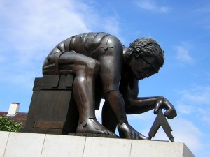
BritishLibrarySculpture

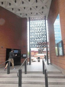
Within, the library is bright and airy, with several different dining options and well-labeled levels.  Chairs of a wide variety of different shapes and types wait for the convenience of patrons of different body types who find different things comfortable.  Card services are downstairs, but no card or ID of any kind is necessary to walk straight up the steps into the “Treasure Room” on the left, which displays a rotating selection of true prizes of the collection: original copies of the Magna Carta, the first draft of Alice in Wonderland, the Beowulf manuscript with the page proofs from Seamus Heaney’s modern translation displayed beside it, the first score for the Pirates of Penzance, Wilfred Owen’s poetry journal with Siegfried Sassoon’s hand-written corrections, Robert F. Scott’s diary, and dozens of other relics which make this free and open display room another worthy pilgrimage spot.

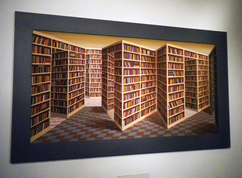
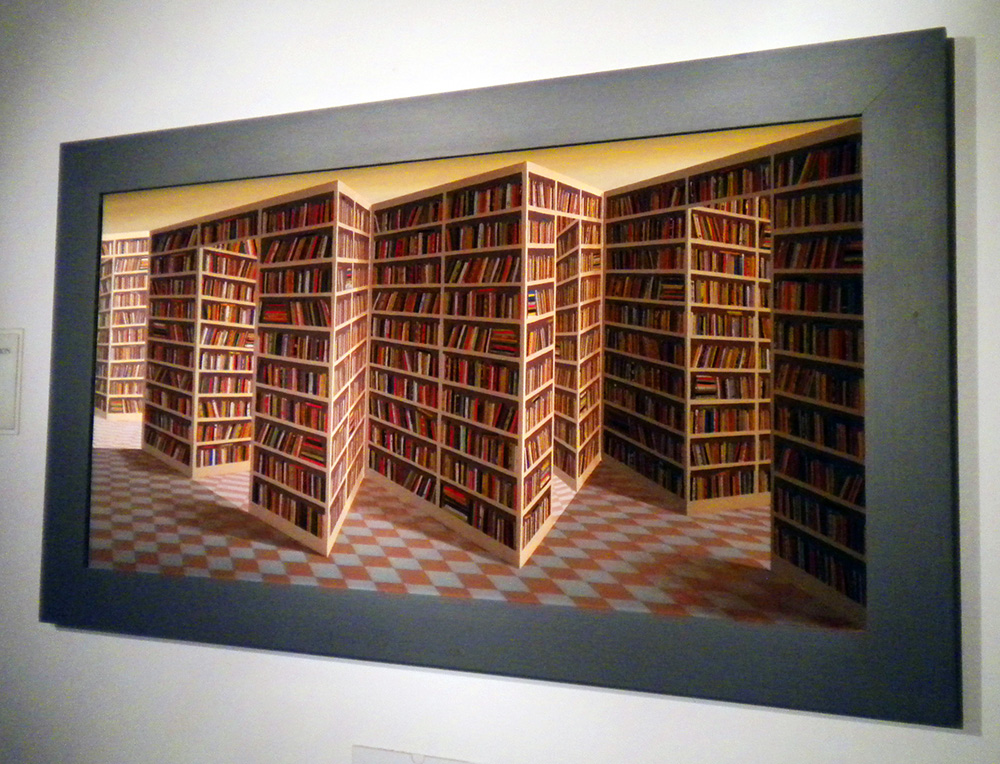
May2013 506Closed stacks are a necessity at such a library, but a selection of several thousand of the most attractive volumes are displayed in a glass-walled interior tower within the structure, so you can see the giddy acres of gilded leather spines, while the rest of the comfortable space is decorated with informational posters about temporary exhibits on topics from sci-fi to propaganda, and whimsical bibliophile art, like the Book Bench and “That thing at the B.L. where you move your head back and forth and it does that thing.”  “Eeh?” you say?  Confusion is natural.  Many a time I have tried to describe this thing to people who have never been to the B.L. and failed utterly, while with people who have been, without fail all I have to say is “You know, that thing, when you’re going down the stairs, where you go like this,” (bob head left and right) for the person to say, “Oh, yeah!  That thing!” and bob their heads slowly back and forth the same way.  Even photographs fail, but since amateur video technology has taken a leap forward in the last year, I can at long last coherently present to you what may be the most fun piece of bibliophile art in the world.  Its actual title is “Paradoximoron,” (created by Patrick Hughes) but all are agreed it should forever be known as “That thing at the B.L. where you move your head back and forth.”  (Below are two photos from different angles, then a video.)

 Paradoximoron1

Paradoximoron2


Long could I sing the praises of the convenience and practicality of the British Library, but today is not a day for library anecdotes. Today is for architecture, and it is time now to face up to its dark underbelly.

Those who, like me, work on rare books often discuss libraries.  When I tell a fellow specialist I am going to a particular city to do research, the instant question is, “Which library?” since Florence, Rome, Venice, London, and other great capitals house several major collections, generally including a main city library, a separate state archive of government documents, libraries of key noble families or monasteries, and one or more institutes which offer modern secondary sources, academic journals, and critical editions.  Just as one can bond with a friend over shared experience of a favorite shop or restaurant, specialists bond over memories of the libraries where careers, discoveries, and even marriages are made.

When I tell someone, “I’m going to Paris for research,” I get the same question, but with a wholly different tone: protective, timid, scared, “Which library?” The veiled grief is the same which, in troubled times, might follow “Big news at the office today” with the tremulous question:  “Good big news or bad big news?”  Research in Paris can be great news: the Louvre, the bakeries, the Pantheon, and if one is fortunate enough to be working on books at the old Bibliothèque Nationale one can enjoy the same elegant gilt wood and stonework one expects, both of great European libraries, and of Paris, whose general city-wide style is elegant bordering on opulent, with occasional pockets of modern avant-garde and gothic grace.

But there is a fearsome alternative.

The new Paris Bibliothèque Nationale is one of the infamous failures of modern architecture.  Located inconveniently far down a subway line near nothing in particular, it achieves the impossible: wasteland isolation in the midst of Paris itself.  This is not the kind of avant-garde that is hated at first but then becomes an icon of its era, like the Eiffel Tower or the Centre Pompidou or Michelangelo’s Last Judgment.  First I will show you.  Then I will talk you through the depths.

 BNParis deckingjpg

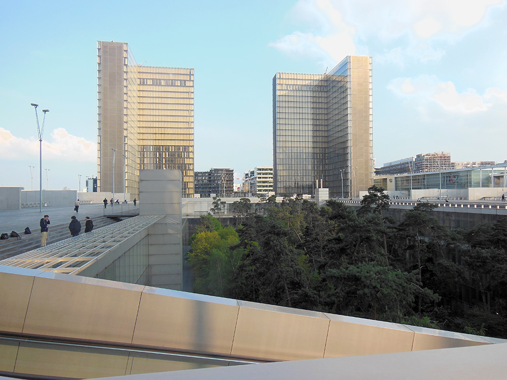
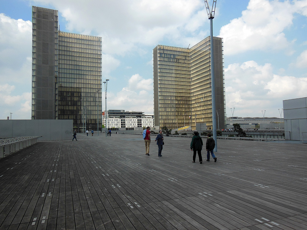
What are we looking at?  We are right now, believe it or not, on top of the library.  This sprawling, nearly football-field-sized sea of unpainted colorless wood planking is both the roof of the library, and its entrance, since the layout requires you to climb on top, so you experience a feeling of abandoned wilderness as the beauties of Paris vanish away below you, leaving you exposed to wind and sky.  The complete absence of color enhances the feeling of post-apocalyptic desolation.

BNParis 352


BNParis 354

Four identical L-shaped towers of featureless glass rise from the corners.  Their completely transparent faces reveal row upon row of identical interior spaces half-shielded by slanted barrier walls of unpainted wood, with occasional glimpses of mass-produced furniture providing the only hint of life.  I have never seen a living person in these towers, and cannot start to fathom their purpose.

BNParis 370


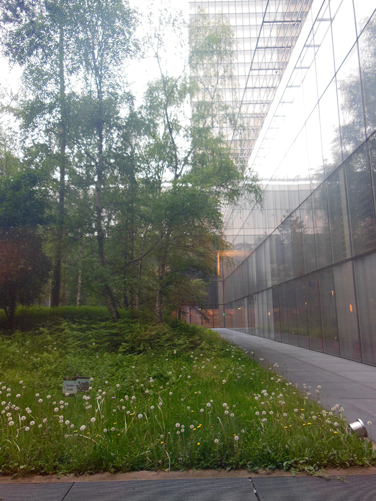
Bars of reflective silver-gray metal fence off the precipices around the outside of the raised wooden walk, and in the extreme periphery cubes of bush isolated within metal cages represent a vague homage to garden.  In the center, emptiness, a cast rectangular pit opens down, and one can just barely lean far enough over a fence of silvery steel bars to glimpse the scraggly, dark tops of trees growing in the depths.  It is down into this pit that we must descend to gain access.

BNParis 367

The whole is so aggressively lifeless that the occasional passing pigeon becomes an exciting reminder of nature.  Apart from the sky (which, on a merciful day, is blue) the only color are the enormous signs in brilliant yellow block writing labeling the two entrances OUEST (West) and EST (East), since otherwise the featureless symmetry of the structure makes it impossible to tell which way is which—the internal labyrinth enhances this confusion, and it is easy to emerge completely uncertain which way lies exit and which way nothing.

We descend via a long conveyor belt along a slanted entry ramp of colorless metal, which provides a better view of the spindly trees in the courtyard.  This is no garden, but an attempt at something “natural”, with woodsy trees and unkempt brush growing underneath. But walled as they are on all sides by towering walls, the trees cannot get as much light or wind or water as nature intends, so they are all thin and wiry, and most require metal struts to keep them standing, creating a sickly parody, neither forest nor garden, artificial without artistry.  It is easy to imagine a dystopian future in which this struggling false ecosystem is the last surviving preserve of “forest” maintained by gardeners who barely understand how trees are supposed to work on an Earth swallowed by the urban waste above.

We enter through glass doors and are examined by guards and instructed to deposit all our worldly goods in lockers, transferring the necessities to clear plastic boxes.  This step is not uncommon—even the British library requires lockers and clear bags—but here one cannot lock things up personally.  Instead we must hand our possessions over to brisk attendants who spirit them out of sight, giving us a numbered paper tag in either blue or yellow (or green, remember the green option).  Stripped and de-bagged, and with our card in hand (if we brought the esoteric materials necessary to secure one) we are prepared to enter.

A cold steel turnstile brings us to mirrored metal doors, then into what feels like an airlock, a completely featureless claustrophobic metal cube with doors on both sides, so we must let the first set close before we can open the second.  It is clear that they can lock them down in an emergency, but how or why, or what one would do if trapped within the airlock, is utterly unclear:

BNParis 564

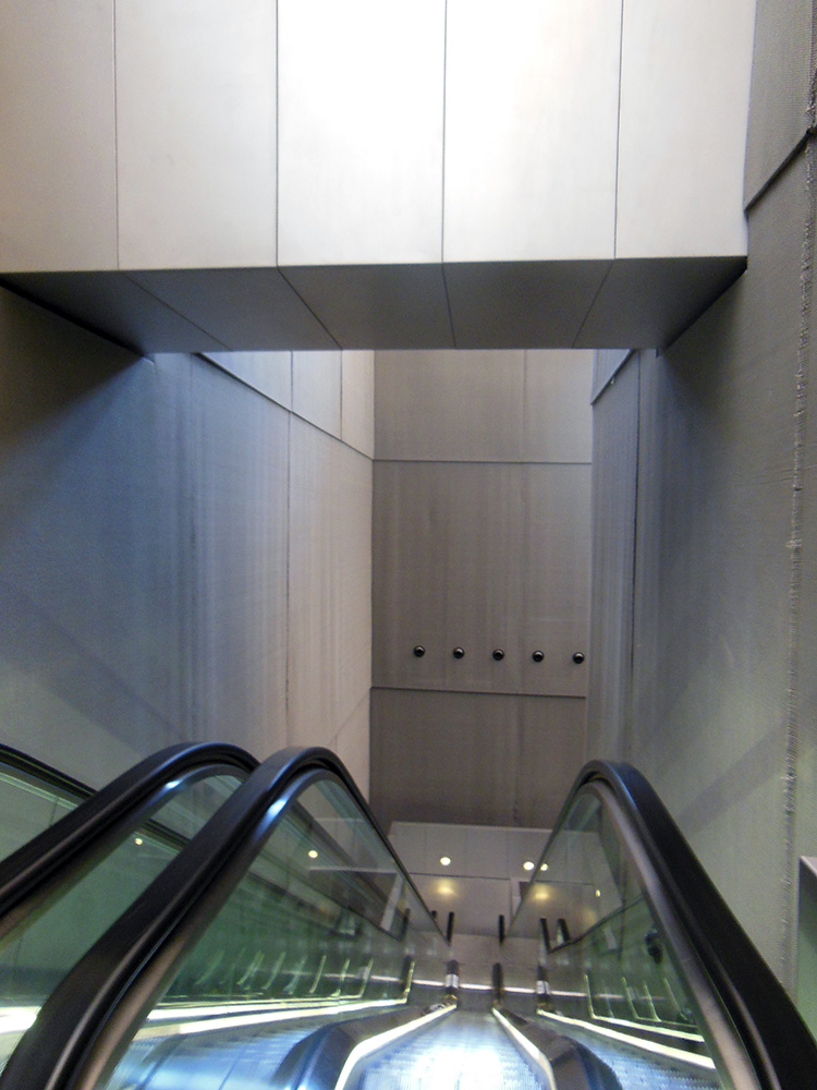
The area beyond is like nothing I have ever seen: a vast space, looming above and dropping deep below, through which an escalator descends, too tiny, like a single stalactite in the vastness of a cave.  The only windows are so high above and so deeply set that they are no more than taps through which light emerges, and I could not honestly swear that it is sunlight and not some substitute.

BNParis 355


Beyond the first escalator lies another, just as dizzying, though here at last the floor is in sight:

BNParis 358

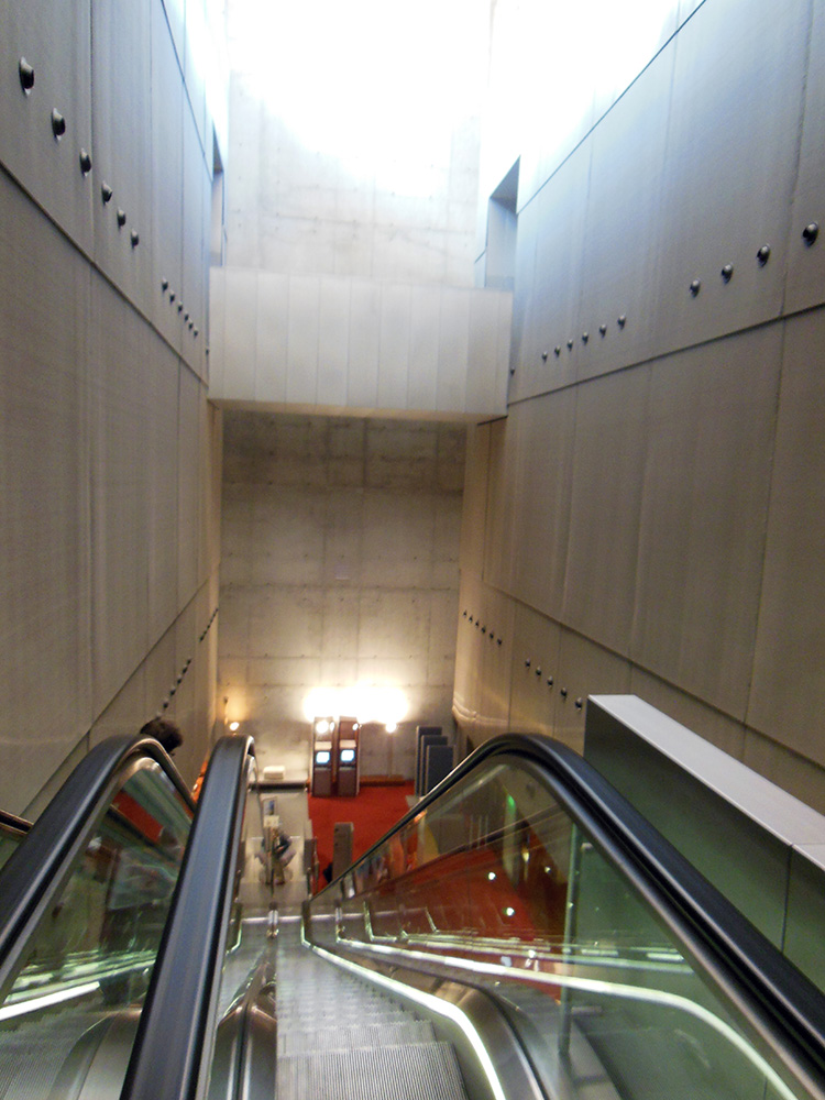
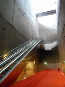
The walls of this dizzying area, which extends around a corner and down another two stories in one long chasm, are covered with (I kid you not) woven steel wire.  These raw, unpainted metal walls, punctuated only by large metal bolts to hold them in place, reflect off the mirror-polished steel escalator framework to create an architecture not unlike the way I would imagine the interior of a robot.  There are no familiar shapes or substances: no window frames, doors, moldings, not even walls or paint, so the rubber banister of the escalator becomes the only curved or friendly substance in the space, unless one counts the vastness of the industrial orange carpet on the distant chasm floor.  In an interview, the architect said the woven wire walls were supposed to evoke the feeling of chainmail.  Because nothing says “comfortable space to read and study” like a material designed to repel savage medieval combat.

BNParis 360

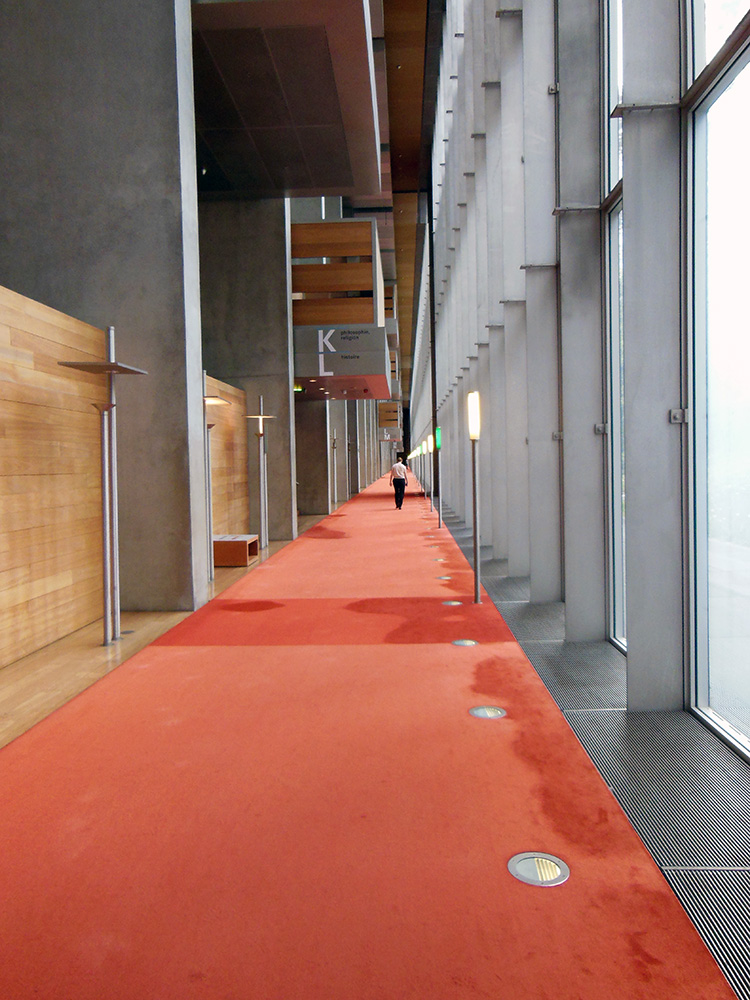
On the chasm floor we face turnstiles, and must present our reader cards to be scanned and approved, or beeped at by irate machines which instruct us to go to a computerized kiosk and argue with a computer who has some grudge against our library card.  Presuming we pass inspection, another silver airlock gives us admittance to the library itself.  The interior space is one enormous rectangle of unbroken corridors, carpeted in brilliant red, while the rest is still glass and unpainted wood looming many stories above us, and stretching on and on and on.  The computer has assigned us a random desk, hopefully in a subsection relevant to our research interests, and we wander the lengths of the box looking for the right letter.

BNParis 387


BNParis 562

The pit, or “courtyard”, with its “forest”, is directly beside us on the other side of the glass wall as we seek our spot, bowed trunks and breeze-tossed weeds a far cry from the Laurenziana’s citrus garden, but at least better than more steel.  But we can’t reach it.  There is no access from the reading room area to the courtyard—we can stare through the slightly dirty glass at life, but can’t actually emerge to stroll among the trunks or smell the leaves.

BNParis 560


BNParis 580The reading rooms themselves are also huge connected spaces, reaching the length of the library, so a cough from one desk reaches half the library, though the incomprehensibly high ceilings help absorb sound.  Periodically the rows of numbered seats are broken up by help desks where sympathetic librarians wait ready to help you wrestle with the automated system.  The work desks themselves are fine, and once Friend Computer consents to deliver your materials it is perfectly straightforward to do a day’s work, once one recovers from the entry process.

BNParis 577Leaving is its own Kafkaesque process.  One returns one’s library materials and heads out the lower airlock to the chainmail chasm, where the turnstile again scans your card and permits exit, or squeals its electric fury and demands that you return to fix some unspecified check-in error.  If the computer decides to set us free, we emerge through another airlock, there to beg for the return of our worldly goods, and must wait in one of two lines depending on whether we received a blue or yellow ticket.  We, in fact, received a green ticket, and mill around in some confusion until we collect twelve other people with green tickets and start clogging things until they consent to send a grudging drudge to take us to an area not usually used for this (or anything) where the green ticket bags have (who knows why?!) been transferred.  We get our bag if we are lucky.  If we are unlucky we receive confused instructions to descend again and try a different exit.  The library is, as I mentioned, symmetrical, so there are, in fact, four chainmail escalator chasms, and one can easily choose the wrong end, emerging to an identical-looking check-out desk where you have to go all the way through the line to discover you are in a completely different place.  But, if Fortune can peer through the wire walls enough to smile on us, we find the right exit and obtain our stuff (Beloved stuff!  Look how not-made-of-metal it is!  Look how it has colors!  Like brown, and beige, and blue!).  Now we exit past the guards, the glass doors, the steel rails that guard the tops of spindly trees, and ascend the (usually not actually switched on) conveyor belt to find ourselves deposited again in the colorless vastness of the wooden decking above.  The overwhelming feeling, especially as everyone is fleeing at day’s end, is that this is not a space designed for humans to be in it.  Or for life to be in it.  Whatever unfamiliar intelligence this place was built for, I have not met it.  The wise know when to flee.

BNParis 378Only upon returning to ground level, when the Parisian skyline and nearby fun façades and bustling streets return to view, does one grow calm enough to analyze this experience.  On purpose, someone built this.  This is not an urban wasteland generated by cost-cutting, or a sudden recession.  This was a very expensive, high-profile public works project designed to display the pride of Francophone scholarship.  And Paris did this!  Paris!  Paris, whose average street corner department store has woven ironwork and imperial grandeur.  People who study architecture and urban planning know the details of the commission, the who and when and why of its construction, but the first-hand experience is just so dehumanizing that I cannot understand how any intentional act of human civilization—of Paris’s civilization—took some wood and glass and metal and created Orwell.  And I am far from alone in my confusion.  In fact, the whole neighborhood around the library is a little nexus of consolation for those doomed to approach it: a movie theater offers instant escapism, food carts bring Paris’s culinary richness, and human civilization shows itself most pointedly hilarious when, on the first corner one reaches after evacuating the wastes above, one finds a pub named “The Frog and British Library.” In other words, “Don’t you wish you were at the British Library?”  Yes.  Yes, I do.

The randomly-selected building across from my cheap hotel in Paris.  With this as the architectural average, the BN becomes even more absurd.
The randomly-selected building across from my cheap hotel in Paris. With this as the architectural average, the BN becomes even more absurd.

But for all this, there is one metric by which the French Bib Nat is a bizarre success.  I have long kept a joke ranking of libraries I use, rating them by how successful they are at preventing people from getting at books.  This facetious metric helps me remain cheerful in the face of particularly impenetrable libraries, like the Capitolare in Padua, which is only open from 9 AM to noon on weekdays not sacred to saints the librarians particularly like (they like a lot of saints), and which so excels at protecting its books from people that it took me three visits to Padua before I managed to get in for a precious two hours and see two books.  By this metric the Vatican is one of the world’s most successful libraries, and the British Library the absolute worst.

But there is a less joking side to this.  In a perverse sense, people are the enemy of books: we touch them, rip them, bend their covers, get our oily finger pads all over them, etc.  The safest book in the world is one sealed away in frigid, nitrogen-rich darkness, far from human touch.  The two duties of the librarian, to protect the books and serve the patrons, are directly antithetical.  I believe this is a big part of why some librarians are so hyperbolically gung-ho about digitization, since touching can’t hurt a digital book.  The majority of librarians, of course, love readers and want books to be used, even though all are aware that use damages them.  Especially in the case of rare books that can’t be easily replaced, libraries must seek a balance in which people use books a moderate amount, so the books can last while the work gets done.  The Paris library achieves this balance to a near perfect degree, since it is so intimidating and inhospitable that no one ever, ever goes to work there unless it is absolute necessity.  Only researchers who have to go will go, and if there is any way to avoid using those books everyone takes it.  Result: productivity with minimal book use, ensuring maximum book survival.  The balance might even be praiseworthy if it had been intentional.  In fact, Michelangelo’s sinister Laurenziana vestibule achieves something of the same effect, since anyone who steps into it immediately flinches back, which certainly drives away some portion of visitors who have no acute need to brave the oozing stairs to reach the reading room above.  Thus we have identified a powerful tool for protecting library collections: scaring off readers with terrifying architecture.  Let’s hope it never catches on.  If it does, I trust you’ll all help me track down the perpetrators and feed them to Michelangelo’s staircase.


Modern Pentathlon: Quick plug for an obscure but awesome sport.

Since our chance to watch it is this weekend, I can’t resist a quick plug for what I consider easily the most exciting Summer Olympic sport, despite being generally regarded as the most obscure: the Modern Pentathlon.  I know most mixed events are obscure and, at first glance, somewhat arbitrary, but when you learn the idea behind the Pentathlon, even the most hardcore non-sports-fan has to get somewhat excited.


The ancient Pentathlon was a set of events intended to showcase the skills of the ideal soldier.  It featured five competitions, each relevant in battle: a foot race, wrestling, long jump, javelin and discus throw.  (If you doubt the relevance of discus throwing in war, check how many people in the Iliad die from having rocks thrown at them.)  Early on in the modern revival Olympics they tried the same thing, but Olympic founder Pierre de Coubertin got the idea to create a new pentathlon to showcase the skills of the ideal modern soldier at the dawn of the 20th century.

The competition is a test of the skills required when escaping from behind enemy lines after being captured.  The competitors must fence (staving off the guards), shoot with a pistol (stolen from the enemy), swim (crossing a river), ride jumping over barriers on an unfamiliar horse (again stolen from the enemy), and run to a finish line (representing the safe border of friendly territory).  The riding event on a horse the competitor has never met before is a particularly tricky variant on show jumping.  The swim, fencing and riding are held earlier in the day, and successes or failures there are translated into points which turn translate to head starts or handicaps in the foot race, at which the first to the finish line is victor.  In recent versions, the shooting has been done during the run itself, so the athlete (i.e. escapee) must stop mid-run at maximum exertion and then shoot a target (i.e. enemy assailant).  The faster a competitor can land the required shots accurately on the target, the sooner he or she can return to the all-important run.  Like in the biathlon (whose combo of skiing and shooting represents northern European military exercises), it takes a special kind of physical mastery to keep the racing heart, shaking and quick breathing from the run from unsteadying the hand.
The Men’s Pentathlon is this Saturday (August 11) and the Women’s Sunday (August 12), and it will be shown (like everything else) in part on NBC. There will also be a full, live webcast on www.pentathlon.org   I have struggled in vain to get tickets, but intend to enjoy the live stream myself, and watch our brave and dashing officers race for that border.  (You can learn more on the surprisingly helpful webpage of one of USA’s promising young Pentathletes, Suzanne Stettitinus.)

When in London, do as the Greeks do.

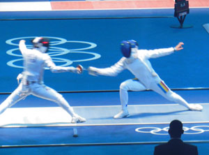
When in London, do as the Greeks do: go to the theater a lot, enjoy antique sculptures, and, if they’re on, check out the Olympics.  So, lest this corner of the Earth be untouched by Olympic fever, I must jump the queue a little bit to share my experience yesterday seeing the Women’s Épée team fencing matches.

The British Library is the most comfortable and convenient library I’ve ever used, and when research brings me here London never fails to be a delight.  Yes, the cruelty of the pound sterling makes everything twice as expensive as it should be, but one can see Shakespeare pretty-much every night for between £5 and £20, all sorts of other theater for remarkably sane last-minute prices, and even more wondrous things, like the British Museum and the Imperial War Museum, for free.  Despite the infamy of English cooking, London is saturated with fabulous ethnic restaurants, sure to delight even those who do not share my perverse love of English full breakfast and Cornish pasties (nostalgia-flavored in my case, since they’re all I could afford to eat in London when I was a grad student).   The layers of London’s architecture are my favorite part: every building on every street a couple centuries off from its neighbor, so Gothic arches flank neoclassical brick and shining modern glass.  Rome has layers too but not the modern ones, since everything in Rome is pretty much 19th century at the latest, so it doesn’t have the spectacular juxtaposition of battlements and space-age towers.  The greatest treasure, in my bibliophile opinion, is the little-discussed Treasure Room of the British Library itself, displaying the most prized possessions of one of the finest rare books libraries on Earth.  Now that is a library dedicated to serving the public.

But London and libraries later – this post is about the Olympics!  I couldn’t not go, since my tight research schedule required me to be here while they were going on.  I do not follow sports, except their history to some extent.  In fact, I had not been to a sports game since my Dad took me to baseball as a kid as a mandatory part of my American cultural fluency.  But fencing I understand, and find interesting, and did myself for a little while.

The big difference for me between attending in person and watching on TV (other than the vitality which always differentiates live events from filmed) was the increased reality added by the absence of editing and post-production.  We receive our Olympic coverage saturated with commentary and, usually, trimmed to eliminate everything tedious or secondary.  The commentary (which live attendees can enjoy if we pay to use a wireless headset) helps with comprehension, especially of unfamiliar sports, but it also has the strange effect of making one artificially critical.  The voice-overs are usually made by experts, even retired Olympians, who spend a lot of their time pointing out the minute mistakes made by the competitors.  The result tends, in my experience, to make one dwell on the negative, sitting there thinking about how constantly people are messing up, and how far from perfect it all is.  Watching live, doing my own analysis with senses alone, I was able to ignore the “Look how tight her shoulders are!” or “Oh, she really flubbed that lunge, look at her weight too far to the side!” and concentrate on the more positive (and easily forgotten) fundamental: Dang, all these women are really great fencers!

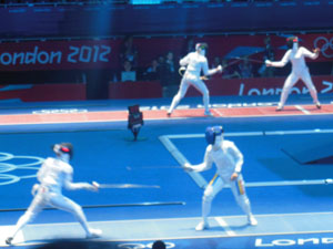
In this case, a beautiful lunge launches an attack which ends up scoring a touch (indicated by the red lights in the bottom right image) for the Russian team against the USA. Also, I love my new camera's zoom lens.

I have long been annoyed by most Olympic (and other news coverage) voice overs, but it wasn’t until I saw the events without that I realized how thoroughly the commentators dictate how you’re supposed to feel about any given moment.  I appreciate that they’re designed to help the majority (including myself) who don’t know a lot about the sports, but information is usually coupled with opinion until it practically spells out: “Sit up in suspense here.”  “Tear up here.” “Frown disapprovingly here.”

Épée is, I’m now quite confident, the most satisfying fencing style to watch, even if foil was my weapon when I fenced.   Épée bouts tend to last a long time, because (for those not familiar) the whole body is a target, whereas the other types of fencing have more limited targets.  Épée  fencers therefore have to be super cautious, because if you make a brilliant lunge but your opponent taps you on the toe or elbow, all is for naught.  It’s also easier to understand, because a hit is always a hit, whereas in other styles of fencing hits sometimes don’t count for convoluted reasons (off target, right of way rules) that make it hard to tell from a spectator’s distance what’s going on.  This one could enjoy without expertise, and it was even easy to tell the difference between a simple and an impressive bit of swordplay after only a few bouts.  Most conspicuous, though, was how constantly bouncy the fencers’ stances were.  We all know fencers need to keep constantly light on their feet, on the edge of springing, so they can dodge and lunge, but, since I hadn’t fenced or watched fencing in some years, the feigned, dance-like springiness of stage and movie fencing had come to dominate my mental image of the fencer’s stance.  As my amateur videos below demonstrate, the fencers’ legs bounce and jiggle constantly, as if their joints are made of some kind of jelly or rubber that’s constantly recoiling from the vibrations of an earthquake.  (If video doesn’t show, refresh.)

(By the way, I don’t know of any rules against posting amateur Olympic video for non-commercial use and they didn’t warn us about it, but if there are rules someone let me know.)

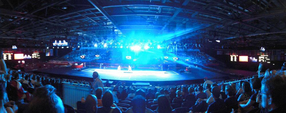
I was more interested originally in seeing the earlier rounds, the quarterfinals and semifinals with all eight teams competing, because that meant more fencing for my buck, and my goal was to study how bodies moved, and how crowds responded, in person at an Olympic fencing event.  In the end, though, even though the day’s quarterfinals did let me see two or even four simultaneous matches for nearly six solid hours, the evening’s two final matches, one to determine bronze & 4th, the other gold and silver, were more exciting.  There were three reasons for this: two cosmetic, one real.

Cosmetic reason #1: the crowd was louder and more enthusiastic.  More seats were filled (though some were still empty, despite the fact that these events were both sold out according to the website), and the crowd cheered more and more loudly.  Cosmetic reason #2: the whole presentation was more dramatic, with the fencers brought in to parade on the main stage and be hailed by name instead of having their names called out as they entered through the side aisles, and with dramatic music (usually choral chanting in a minor key with hartbeat-like drums) played between every bout.  This gave the event much more energy, even though there was a lot more going on at the first event.  In some ways it is strange that the crowd was more excited at the finals, since there were eight teams in the beginning so many more of those attending had home teams to root for than in the final, in which the mainly European audience had few opinions on South Korea vs. China, but the presentation and the mass of people sure got the volume up.

The real reason the second bout was more enjoyable was that the teams were more evenly matched.  Each clash of teams involves nine consecutive matches, and the hits are added together, with the winning team being that which reaches 45 points or is ahead when time runs out.  Consequently it’s easy for one team to get way ahead, and have an unassailable 10 or 15 point lead before the midpoint of a match, after which the fencing is still fun to watch, but suspense is gone.  This happened in most of the early matches, but the later matches were much closer, with long periods of tight scores, one team pulling ahead then the other catching up and overtaking in fierce alternation.

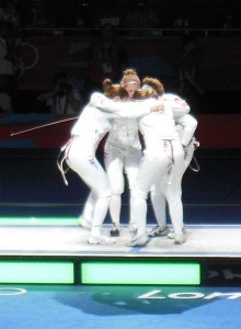
Team USA's huddle before the bronze match

The big surprises in this event were the unexpected defeat of the Romanian favorites, who were knocked out in the first round finishing sixth, and the unexpected success of the American team, who started so far out of the commentators’ notice that, not only were they not mentioned in the review of which teams we were to keep our eyes on, but when the host went through the crowd asking people to cheer in turn for the countries they were rooting for, he skipped the USA entirely.  Nonetheless the US made it to the Bronze vs. 4th place match against Russia, which was incredibly tense and close, with the US behind through most of the first 3/4, then pulling up to a tie, and for the last four rounds the teams were neck and neck, pulling ahead alternately only to fall back again.  They ended tied, so the match was settled by a single touch instant death bonus match, and the US achieved victory by a hair.

The Gold v. Silver match between China and Korea was less dramatic because China pulled well ahead in the second half.  There the interesting part was the crowd reactions, as the mainly European crowd became comparatively equivalent in their team support, everyone clapping equally for both sides, while small pockets of Chinese and Koreans in the crowd outed themselves with deafening bellows and chants whose meaning we could only vaguely guess at.  Not that sports chants set a high bar for grammatical or intellectual complexity even when they are in familiar languages.

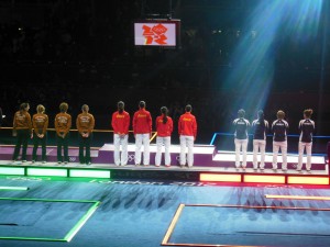
As for the medal ceremony, seeing it from behind and from a distance was less thrilling than the TV versions that zoom in on faces.  I did enjoy watching the apparently logistically convoluted process of assembling the thing the athletes stand on during the ceremony (there was apparently some debate about which bit went where).  The most emotional moment for me was when the honor guard entered carrying the medalists’ nations’ flags, not a moment TV often lingers on, but the strict honors paid by the host country to the flags and the ideals of international brotherhood they represent was quite moving.

One more general Olympic note: the crowds were very mild.  London has poured an amount of effort into logistics, and despite the fear, and rumors, and posters on the subway warning of crowding with a cartoon of a dressage horse on an escalator, the subway was clear, the street traffic reasonable, the shops well stocked, and everything smooth.   London-resident friends report that if anything there is less crowding than normal for the time of year, because so many people are staying away for fear of the games.  Shops and theaters especially are apparently losing business, and offering consequent specials.  The Olympic park and all the venues are marvels of architecture, practicality and urban planning, and real live people on the street are just as excited as the talking heads about what a long-term boon it will be for East London.  So, go UK Olympic organizers!  Except for the tickets being nightmarishly difficult to get (a saga for another day), they have done extraordinarily.

Irrelevantly, somehow in 2008 I missed the fact that they made this awesome animated Journey to the West themed video ad for the Beijing Olympics.  It’s fantastic, really, probably my favorite commercial since Astro Boy and the Buddhist spirit of life and reincarnation (the Phoenix) told me I had to buy a Toyota Prius.

Spot the Saint: Peter and Paul

When one has an altarpiece, and wants to flank the central Christ or Virgin with a pair of solid, unobjectionable companions, ones which make no particularly strong statement about one’s patron or native city, one can always fall back on Peter and Paul.

Saint Peter (San Pietro)

  • Common attributes: Keys, one gold one silver or both gold
  • Occasional attributes: With/on a boat sometimes, generally old, fluffy white beard, wearing Roman-type robes.  Sometimes he’s dressed like a pope or has pope accoutrement, which he has every right to.
  • Patron saint of: Popes, fishermen, shipwrights, other types of workmen like cobblers, carpenters, bakers, masons &c.  A working class saint.
  • Patron of places: Rome (Vatican), Cologne, Las Vegas, Philadelphia, others
  • Feast days: Jan 18, June 29, August 1
  • Most often depicted: Standing around with other saints, receiving keys from Christ, in chains in prison, escaping with the help of an angel, being crucified up-side-down, scared and in a boat
  • Close relationships: Paul, popes
  • Relics: Rome, St. Peter’s Basilica

Peter, of course, one sees everywhere in Rome, since popes never tire of reminding the public who they work for, and there is no better political endorsement.  There is an interesting rank split in Peter’s associations, since, on the one hand, as a humble fisherman he’s a the poor tradesman class, someone whom a simple Renaissance laborer might identify with and expect to understand and sympathize with his travails, while on the other hand as founder and patron of the papacy he is the master of popes, who are in turn masters of kings and (depending on whose propaganda you believe) successors to the Caesars.  Prince and peasant in one figure makes for a lot of interesting decision-making come portrait time.  Occasionally one sees Peter dressed as a pope, to accentuate this status, but most often he’s in the usual Apostolic uniform of a loose tunic/robe with a loose toga/wrap around it, usually in two different bright colors and generally not pink (that’s for John the Evangelist).

The keys to Heaven make Peter one of the easiest saints to recognize.  Often if they are depicted as one gold, one silver, the silver leaf sometimes used on the silver one will tarnish over time and turn black, which can be visually confusing.  Peter’s keys by themselves are the symbol of the papacy, and if combined with a papal triple tiara and put over a coat of arms indicate the arms of a pope.  Seeing Peter on something should always make one wonder whether it was paid for by a pope, or made in Rome, but the man who mans the gates of Heaven is all-important enough that everyone everywhere is inclined to invoke, and depict, him as often as possible.

Saint Paul (San Paulo)

  • Common attributes: Sword (standard two-edged broadsword usually)
  • Occasional attributes: Book, long beard, wearing Roman-type robes, sometimes younger in Roman armor
  • Patron saint of: P.R.
  • Patron of places: Rome, London, Umbria, many other places
  • Feast days: Jan 25, Feb 10, June 29, Nov 18
  • Most often depicted: Standing around with other saints, having his blindness cured, being arrested, being beheaded
  • Close relationships: Peter, Ananias of Damascus
  • Relics: Rome, Saint Paul’s Outside the Walls (San Paolo Fuori Le Mura)

Remembering that Paul was a Roman citizen and originally charged with persecuting Christians before his vision, blindness, cure and conversion, a few artists like to depict him in his younger days.  His beheading is reported only in incomplete and unclear documents, but he carries the headsman’s sword, which must always be two-edged because, as it’s told, the sword which struck Paul made him an even more powerful agent of Christianity, thus metaphorically cutting back at its wielders.  The vast majority of images of St. Paul that I find here in Florence show him standing symmetrically opposite, or sometimes next to, Peter, as the two major and universally-respected Roman saints.  Often Paul’s beard is longer, and sometimes more on the gray side, compared to Peter’s.

Peter and Paul were also good friends, and one sometimes sees the scene of their friendly embrace.

When I say Paul is the patron saint of P.R., that’s my best summary of his extensive list.  Apart from the usual hailstorms and snake bites that all major saints wind up being associated with, the motif of Paul’s patronage is of publicity.  Because he himself was such an ardent and vocal proselytizer, and left so many writings responsible for aiding the spread of early Christianity, he is invoked as patron of people who convert, people who try to convert other people, but also of authors, and publicists, and journalists, and editors, and people who write hospital newsletters, and generally all people who are responsible for informing people of things.  Blogs too, I suppose, though G.K. Chesterton has also been nominated.

AND NOW, QUIZ YOURSELF ON SANTS YOU KNOW SO FAR:

Who do we have here?

A flanking section from Fra Angelico’s Perugia Polyptych. Can you tell which side of the image Christ is on?

Jump to the next Spot the Saint entry.